 Still making our way through the phallic arrow "i" of Horus class of occult symbols, our journey brings us to - Journeys. If you're new to the blog, welcome. You have some catching up to do before this will make much sense.
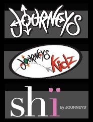 Journeys is a youth oriented shoe store chain you'll find in malls and plazas. Their shoes for males branding together with associated women's and children's brands signal the Horus Eye illumination with featured symbols of genitalia.
 The Journeys logo features four arrows that extend outward from the letter O.
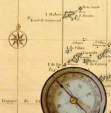 Superficially, this represents a compass rose as commonly found on a map. The arrows point out the four directions and points of the compass, North, South, East and West. Since people walk in shoes and may travel on a journey, the compass rose is a very appropriate association. Yet, it's just a cover for a very clever set of evil symbols. Let me explain.
 Notice how three of the arrows are short but one is much longer. The long arrow doesn't extend all the way to the end but stops short, pointing at the letter Y. The Y is being called out as the Y chromosome, the male gamete, seed.
 The long arrow representing the male member emits seed that is identified to us as the seed of the serpent, Satan. Consider the stylized serpentine letter S on the other side of the Y. It's very obviously snake-like, also resembling the infinity "8" as an equivalent of the Ouroboros.
 This phallic arrow sows the seed of the serpent. The coming version of this reproductive scheme is most widely identified as the mark of the Beast.
In a wider view of the brand imagery, this male "package" includes the letter J, comparing to the Jiffy Lube version.
Notice how the head of the long arrow forms part of the letter E. Consider the last three letters - EYS. In some fonts, what we know here is an S is actually the letter E. EYE! See it? It's not really that subtle.
 If we take it as plural, where are the eyes? There are three.
 Occupying the central position of the word, the letter R with its extended leg and the arrow piercing its "eye" is the wedjat Eye of Horus, the third eye. Bracketing that anja chakra "bindi" eye of enlightenment are the other two eyes.
The right eye (on our left) is framed as suggested by the arc of the stylized letter U. This eye has as its pupil the letter O, from which proceeds four arrows. There is the evidence of sex magick in this dynamic and focal region of the graphic. The O with an X inside is a transdimensional portal of the female gender, pictured with projecting arrow seed. This symbol is also a solar cross replete with rays of white light.
The left eye is framed as suggested by the arcing letter N. EYE
As a compass direction, the long arrow points eastward, which is the direction from where the Messiah will be coming. (Ezekiel 43:1-5) The phallic arrow of Journeys signals the coming antichrist Beast aka Horus.
The Journeys kidz brand is a playful image that anyone accustomed to diapering little boys should recognize. The little arrow is peeing - LOOK OUT! This dynamic is connecting with an arrow of the Journeys logo to signal us that those arrows should be considered as adult versions.
[update: 5/29] The letter k in "kidz" is a drawn bow. The arrow being fired is revealed by the shadow it casts, the gray arrow at its base. While the form of the arrow is presented in shadow, what is shot from the bow appears as we consider the i next to the k. The dot of the i is the "red sun" "i" of Horus, the pyramid's capstone, his seed. The z that has been substituted for s (kids) signals Zeus, testifying that "kidz" means the "kid" belongs to Zeus. Apollo, aka Horus, is the son of Zeus. Beyond that, it signifies that the kids who wear the brand belong to Zeus. "I'm Zeus' kid," it declares.
The brand for young women, shi, has two dots over the i. Comparing to the signal anatomical arrows, the two dots are breasts. If you consider the highlighted "i" in the fashion that has been the custom in this series it would signal the "i" of Horus. However, given the obvious female gender we must identify this branding with Horus through his mother Isis.
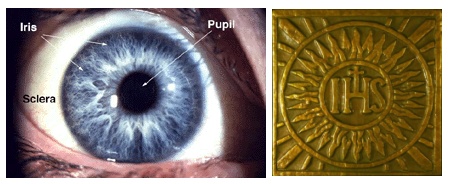 The shi branding has been around for a very, very long time. In one guise, you'll recognize it more readily if the letters are reversed and capitalized, like in this image.
 shi = IHS
The two dots are breasts, and eyes.
 The Journeys brand family tells the tale of this epic journey. Behind the three in the header, JOURNEYS, kidz and shi are Osiris, Horus and Isis, the ancient Egyptian trinity.
  I'm not one of those people who thinks everything occult resolves to the direct covert involvement of the illuminati or Freemasonry, but sometimes it does. That seems to be indicated here.
 Every journey that has a destination requires some form of navigation. There is a reason to connect the Journeys logo with the primary symbols of Rosicrucians (rose+cross) through the compass rose that is also a solar cross. You will note that the O in the Journeys logo closely resembles the O in the official AMORC branding. There is also a definite link to a primary symbol of the Masonic Lodge, the compass of the compass
 and square. There are two kinds of compass used on journeys as navigational tools. One is magnetic for indicating direction and the other is the divider used for measuring distance. The familiar square and compass are used in the building trade but also for navigating. The Order of the Rose Cross and Freemasonry have been all about the journey of man that follows Lucifer as the great architect of the universe, so called.
 The parent company of Journeys and its companion brands, Journeys for Kidz and Shi, is Genesco, headquartered in Nashville, TN. Nashville happens to be the home of a full scale replica of the Parthenon in Athens, Greece. Inside is found an 41 foot tall gold gilded idol, the goddess Athena Parthenos. Nashville is considered (William Henry) to be among the most occult cities in America.
In closing, here's a video you may find interesting. Esoteric Adventures in Nashville

No comments:
Post a Comment