
 I just posted about Hillary Clinton supporting the Human Rights Campaign. Today, I saw their ad on one of the web pages I visited while doing some research. My friend Jonathan brought their logo to my attention a few days ago, noting how it reminded him of a positive pregnancy test.
 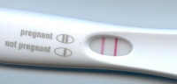 I saw the two pink horizontals as a pair of females, one on top of the other. When I saw the ad with the logo and slogan together, I saw something else worth noting. Their slogan provides the key to interpreting the graphic riddle. Be on the right side of history. Assume the logo has two sides, dividing it down the middle. Follow their direction and flip the left side to join the right. The solution is 33, the familiar signal number for Freemasonry and ritual sodomy.
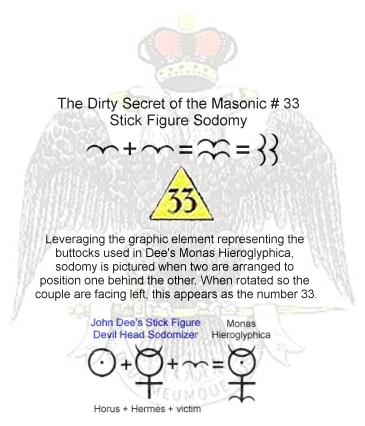
Marriage equality? That's not even close to the goal they've got in mind. The Human Rights Campaign is part of a movement to make everyone homosexual. The 33 and the pink female-on-female symbols speak loudly. Their ultimate goal is to birth the Baphomet androgyn antichrist through this effort, and the popularity of seeking support for HRC is kind of like testing positive for pregnancy.
The antichrist delusion sweeps the world. The symbols of the movements and organizations do more than create brand identities. “Signs and symbols rule the world, not words nor laws.” Confucius understood.
This is imbecilic. The logo is an equal sign and for it to be determined as anything else is absurd and highly offensive. I can not believe anybody has the audacity to make such an ignorant and insane statement
ReplyDelete