
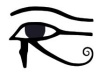
 This survey of "i" of Horus imagery continues with more examples from big players in the high tech sector. These company's products generally feature integrated circuits. These are known as ICs. Hmmmmmm. Suitable enough! Eye Sees!
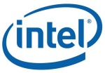 The Intel logo features the Eye of Horus in several ways. The dot of the i is part of an orbital trace that signals this as the "i" of Horus. The elliptical trace encircles the company name to form the outline of a large eye. Adding the registered trademark symbol brings the total to three distinct eye of Horus symbols. The ® appears at the same height as the dot in the i, making it a left eye opposite its matching right eye. Since the dot in the i is associated with the big encircling eye, it "sees better" than the little ®, signaling Horus "who rules with two eyes."
The letter "t" is called out by showing only one side of the cross. The other side is there but it's been displaced, appearing as the square that dots the i. The t is in the center of the big eye and is graphically linked to it through the "i." These features identify it as a portal and symbol of genetic transformation. A cross represents the union of the sons of god (vertical) with the daughters of men (horizontal).
The official meaning of Intel's name is Integrated Electronics. Their tagline has long been "Intel Inside" or some close derivative. If we take their identification with the eye of Horus seriously, their name and slogan is recognized as signaling that the mark of the Beast is what they're really about. Their business is microprocessors. An implanted microchip (PositiveID) is based upon this technology, the word "microchip" being an abbreviated form of "microprocessor chip." Microprocessors are one facet of the technology that is becoming the mark of the Beast. If you take the mark, receiving the implant, you'll have what is meant by "Intel Inside." "Integrated Electronics" indeed, on a personal level!
One of the facets of the mark of the Beast facilitated by this microprocessor technology is surveillance, as observing with an all-seeing eye. With GPS tracking capability and the ability to be read remotely without the subject's knowledge or permission (which capabilities are already being leveraged in the marketplace), an "Intel Inside" kind of chip will provide what's referred to by some agencies as intel, betraying the recipient's identity and whereabouts to whomsoever might be authorized to access and monitor data acquired by the connected networks. When I listen to their four note [mp3] mnemonic jingle now, I put some fitting words to it: "Mark of the Beast"!Now, if you look at a registered trademark or copyright symbol and think, "There's no way that's an eye of Horus," that it's just an innocent little symbol, you should consider whether there really is such a thing as an innocent symbol. Some symbols may be presented in relative ignorance but, even then, that doesn't make them innocent as devoid of meaning and evil influence. Consider how there is no legal requirement to associate a registered trademark symbol with a logo. Visit some big name corporate Web sites; some have it, some don't. Its appearance seems to depend less upon whether it's a registered trademark than whether the eye of Horus enhances or detracts from what the logo is intended to signal.
IBM, eyeBM, I be M and I BM
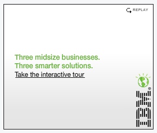 While this ad and version of IBM branding doesn't have the swirl, I'm including it here because the company has close ties to Intel. Its also fitting because this rather obvious "i" of Horus variation of their more conventional logo leverages the ® to present a second eye. This eye compares to the illuminated (radiant sun rays) globe-eye with eyelashes that dots the big i as the lesser of the pair, signaling Horus "who rules with two eyes." Hello eyeBM!
 This ad hints at 9 on the left to balance the opposing stylized "9th letter of the alphabet" i. There are three lines, the first two of which begin with "Three." We subconsciously follow the subliminal lead to infer the third line as another three, completing the nine. The third line prompts us to "Take the interactive tour" that apparently will get us beyond line two's hint at illumination and gnosis ("smarter solutions"). The two lines that suggest the content and purpose of the third appear in the same "Osiris" capstone green as the illuminated globe-eye. Hint. Hint. Check your wallet for a match on that. Hint. Hint.
 The bars effect also smacks of a bar code, which presents us with myriad connections to such as DNA barcodes, the Hollerith punch card (see below) and similar data logging and tracking technologies that all point to the mark of the Beast network and genetic portal.
 If you are familiar with the history of IBM's Thomas Watson Sr. (from the Burned Over District in NY) and the Hollerith punch card you are already aware of his support of Hitler and the Nazi Party.
 The Nazi data management facilitated by IBM and the Hollerith system should be seen as a precursor to the coming mark of the Beast implementation.
 Hitler had the swastika brand, a sun wheel and Apollo or Horus symbol, as you may recall from an earlier series on the Olympic rings logo. Watson, a Freemason, had his comparable branding.
The version you see here represented IBM from 1924 to 1946. It has a swirl, but it's not calling out an i, just an eye. It's supposed to be the globe of the Earth.
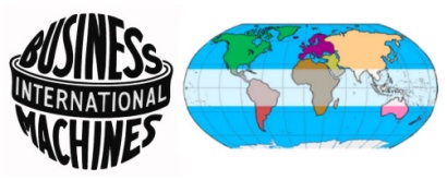 Can you see SIN exalted over the Earth? A band wraps around the equator, the area through which the sun oscillates to mark off 46 degrees, 23 above and 23 below. This signifies the sun god's rule over his global/international domain. It doesn't take much imagination to "connect the dots," suggesting that "business machines" refers to those of us who dutifully engage in the activities of Mystery Babylon and serve in the pharmakeia of the wand of the god of commerce Hermes, perhaps the chief facilitator of Horus. At the top of the equatorial band is a line that appears to give the graphic depth. This line accentuates the ellipse as a feature and makes the graphic appear as an eye.
The acronym IBM stands for International Business Machines but consider it as a literal declaration of identity: "I be M," or, "I am M." Who or what is M?
The M is leveraged in occult signaling with layers of powerful symbolism. Sometimes the two points on top are used to signify horns as of the devil. Depending on the form, an M might present a central downward pointing delta with adjoining upward deltas to signal the daughters of men with the sons of god. The M is perhaps most notably the 13th letter of the alphabet, and the number thirteen that means "lord" and "rebellion" signals the rebel Beast. Because M is a sideways numeral 3, another key set of elements is imported; the third eye, regeneration or resurrection and the triple helix transformation of the mark of the Beast. By counting all the points on an M, the two on top and three on the bottom present the number 23, signaling through this sex chromosome number the sexual reproduction and genetic transformation aspect of the mark. Also, I believe M is for Man and W is for Woman. "I be M"
Here is wisdom. Let him that hath understanding count the number of the beast: for it is the number of a man; and his number is Six hundred threescore and six.
Revelation 13:18The letter "B" presents a 23 because its the 2nd letter of the alphabet and a numeral 3 is implicit, formed on its right. Its also a 13 as a 1 and 3 stuck together. You can now perceive another declaration of identity, "I BM." Both B and M have 13 and 3 and 23 numeric features in common. If we assign the 23 value to the B and the M it reads, "I 23+23" in a self-reference to man's 46 chromosome body, with a beast transformation in its future. IBM says a lot with very little.
There's more to be seen in the evolution of the IBM logo, but not in this post. I'm not even going to mention how the strict uniformity of the appearance of its personnel (dark pin-striped suit, white shirt, quiet tie, wing-tips) made the IBM corporate culture stand out as something of a collective, or how the "think" motto was ever in view (intellectual enlightenment). Uh, oops. I just did. :)
Micron
 In Micron's logo, the i is "dotted" with the orbital trace, calling it out as an "i" of Horus. The invisible satellite is orbiting the stylized letter M, tracing the elliptical outline of an eye. The ® forms another eye that, as with the Intel logo, matches to its opposing partner as a lesser eye to signal Horus "who rules with two eyes."
The letter M is styled with a longer leg that gives the graphic an extra dynamic. Surrounded by the swirling eye, the M is pictured passing through the eye portal. You already know about the M. Micron's logo is signaling the third eye portal!
Micron is the parent company of Crucial, whose c-ing "i" logo and branding has recently been addressed at some length. Hey, Crucial is kind of a chip of the old block. :)
What's not funny is how the eye of Horus branding is so dominant. When the time comes for the mark to be offered, those who have continually bought in to the scheme will have no awareness of the real danger, and no ability to resist. If the eyes of your understanding are being enlightened (Ephesians 1:18) you may want to give some of those around you a chance to see themselves as the prey they truly are in this deadly scheme. It matters.
No comments:
Post a Comment