Monday, May 30, 2011

Part 35 - See, it's the "i" of Horus! Groovin' Uptown with Gucci and Coco Chanel

Moving upscale in this survey of "i" of Horus occult symbols, Gucci is another phallic arrow brand.
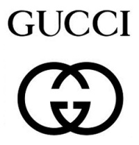
Their logo is a simple graphic of the letter G for Gucci overlaid with an offset mirrored version of the G. The image formed is more complex, a subtle picture of copulation in the "missionary position."

The head of a phallic arrow is formed in the lower center, pointing down. It's presented in the negative space (like FedEx) framed around the horizontals of the G and its mirror. At the top of the graphic we see the male's buttocks and at the bottom, the female's. You can also picture the feminine vesica piscis (intersection of two circles) as the vulva.

The image is an oval eye, with an inner pupil, and also two eyes with a third between them. The Gucci logo is an eye of Horus with sex magick.

Some of you reading here might be saying, "So what?" If this is you, I suggest going back, even back so far as the end of October 2009 where posts to this blog began a theme of exposing an epic ploy that preys upon unsuspecting victims through symbolic imagery. This is a wicked deception that poses a grave threat to each and every one of us today through subtle demonic influence and intends to rob us of our very souls.

The G associated with the GUCCI logo is for GUCCI, but also for gnosis, the knowing of the enlightenment of the activated Eye of Horus. The G is the gnosis of the partaking of the fruit of the tree of knowledge of good and evil. I believe this G also references the G-spot, of female sexual eroticism.

The GUCCI name can be spelled out and interpreted as: G. You see. See, I. CI = See EYE! CCI = Seeing eye. UCCI = You seeing eye. GUCCI. We GETCHA! The logo works with a forceful dynamic, promoting what many will recognize as the mark of the Beast.

Further evidence of the procreative theme can be noted in the associated imagery you see at the bottom of this collage that appears on t-shirts promoting the brand. This features a modified version of the doubled G Gucci logo. Technically, instead of the second G being a mirror of the first it's a version that's offset and rotated 180 degrees. This presents us with a sexually ambiguous variant that is open to a diverse array of valid interpretations that are supported by the accompanying imagery.

In their enhanced version of two people coupling we can either see two phallic forms, one upward and one downward, or no phallic form. We can see it as two men coupling, two women coupling, or as a man with a woman on top or on the bottom, superior or inferior. The range of optional interpretations is supported by the way the name GUCCI is repeated with alignments in four directions, which suggests that we rotate the graphic and consider what appears. "See this coupling any way you want," we're being told. The flag background upon which the double G appears isn't one I can identify precisely, but given the variety of flags that have come to represent sexual preferences and associations (as seen in this collection of LGBTQ symbols) you will note close comparisons with bisexual, transgender, intersexual, genderqueer and pansexual imagery. A statement is made declaring, in essence, that the G also stands for "Gay."

I believe the G-in-the-middle GUCCI logo alludes to the familiar emblem of Freemasonry that is itself a graphic of procreative activity. You can see the square and compass outlined in the GUCCI badge emblem, which also features the vaginal heart and phallic crown.
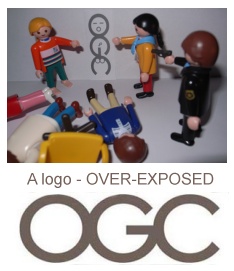
In perpendicular rotations, you may more easily consider how the horizontal protrusions of the letter G become the male phallus, as in the OGC logo imagery that someone perceptively dramatized in this presentation at right.

GUCCI has leveraged the Eye of Horus and procreative aspects in their marketing that promotes the mark of the Beast. There's a trend, here.

Another very similar brand is that of Chanel, famous for high fashion, couture, expensive fragrance and sexual allure. Theirs isn't a phallic brand but one that is very feminine, yet, it is fitting to present it alongside Gucci for similarities that should become obvious.

Like Gucci's G, the C or C's of Coco Chanel are presented with one in standard configuration plus one as an offset mirrored version.

Chanel is a very feminine brand, featuring a vesica piscis vulva symbol in the logo's intersection of two letters C. The combination may be considered in default alignment as a sexual coupling with one person atop another pictured with buttocks above and below. An alternate perspective of a coupling is presented when considered from a perpendicular perspective. Chanel illustrates this view for us by positioning a man and woman on a mosaic floor over the brand's graphic. They are embracing front to back, but the graphic can certainly be interpreted as the more common front-to-front coupling.

In the Chanel No 5 promotional imagery you see in this collage the Eye of Horus could hardly be more evident. While merely present in suggestion, little is left to the imagination. The Coco Chanel CC brand is a C-ing Eye, promoting the Eye of Horus procreative agenda. The IHS version I included in the collection is, of course, the Pope's non-exclusive RC brand, appropriated from more ancient sources, appearing here for ready comparison.

Chanel No 5 could well be called a love potion. Given the history of the product line and the signaling, I accept that it is that, primarily for Horus.

Perfume is largely the work of chemists, and alchemists, if you will. It's about "pharmakeia." This industry began as documented in the book of Enoch, which is an expanded account of the Bible's 6th chapter of Genesis.

And they took wives for themselves and everyone chose for himself one each. And they began to go into them and were promiscuous with them. And they taught them charms and spells, and they showed them the cutting of roots and trees.
Enoch 7:1

1) And Azazel taught men to make swords, and daggers, and shields, and breastplates. And he showed them the things after these, and the art of making them; bracelets, and ornaments, and the art of making up the eyes, and of beautifying the eyelids, and the most precious stones, and all kinds of coloured dyes. And the world was changed. 2) And there was great impiety, and much fornication, and they went astray, and all their ways became corrupt. 3) Amezarak taught all those who cast spells and cut roots, Armaros the release of spells, and Baraqiel astrologers, and Kokabiel portents, and Tamiel taught astrology, and Asradel taught the path of the Moon. 4) And at the destruction of men they cried out; and their voices reached Heaven.
Enoch Chapter 8

The Chanel brand carries a lot of cache. "Eighty-eight years ago, on 05.05.21, Gabrielle Chanel launched her first fragrance – Chanel No.5. Today, Chanel No.5 is still the world’s best selling fragrance and, according to Chanel, “a product in the Chanel No. 5 portfolio is sold every six seconds.” Because of this legacy, Chanel No.5’s advertising is always the pinnacle of ad campaigns." Chanel No.5 Commercial Sneak Peek (La Chanelphile - 3/26/2009)

On a technical level, the date as identified may be summed according to occult practice.

0+5+0+5+2+1 = 13

Thirteen means rebellion and Lord Beast. The thirteenth day of the first month is the day modeled in numerous biblical accounts as the day the Beast will be revealed as a sign.

If we choose to expand the date, the sum is equally significant.

5/5/1921
5+5+1+9+2+1 = 23

The number 23 is how many chromosomes each parent contributes in sexual reproduction. This number is a common signal for the mark of the Beast DNA transformation, representing the serpent's own contribution.

C is the third letter of the alphabet. CC mathematically equates to C squared or 3x3 - alluding to the Masonic Royal Arch Degree ritual called Three times Three. The product in this equation is 9, the single digit mark of the Beast transformation signal!

When I read the official claim that “a product in the Chanel No. 5 portfolio is sold every six seconds,” it speaks to me of the number of man, and the number of the Beast. My mind's database readily pulls up the fact that there are 60 seconds in a minute and 60 minutes in an hour. On an hourly basis, my mind perceives something like 6 6 6. One sold every 6 seconds equates to 600 in 60 minutes. Do the math. Is the sales figure accurate? I have no idea, but I get the signal. Selling, like buying and selling. 666. Number 5 - five meaning everyone in the whole world. Revelation 13.

16) And he causeth all, both small and great, rich and poor, free and bond, to receive a mark in their right hand, or in their foreheads:
17) And that no man might buy or sell, save he that had the mark, or the name of the beast, or the number of his name.
18) Here is wisdom. Let him that hath understanding count the number of the beast: for it is the number of a man; and his number is Six hundred threescore and six.
Revelation 13:16-18

Apparently, the perfume industry calls Chanel no 5 "le monstre." How apropos! Gabrielle Chanel's familiar name "Coco" was a "shortened version of coquette, the French word for 'kept women," according to an article that appeared in a publication called The Atlantic. She was indeed the kept woman or mistress of a series of wealthy and influential men, never marrying. Clearly living a life of disregard for the assigned role of a chaste woman as helpmate, the names of Jezebel and the female identity of Mystery Babylon, mother of harlots come to mind.

Gucci's and Chanel's branding images present an eye-full of Horus Eye imagery. Are we yet under their spell? Are we yet free of it? Does their provocative marketing hold sway over us still?

Lord, forgive us where we have allowed ourselves to be seduced by the devices of our enemy and yours. Grant us that we may become free of the controlling influences that have bound us as participants in willful rebellion against you. Thank you, Lord, for hearing our pleas and bring your favor in this hour of our great need, so that we might be made worthy of you at your coming.

Friday, May 27, 2011

Part 34 - See, it's the "i" of Horus! Journeys' Phallic Arrows Point the (wrong) Way

Still making our way through the phallic arrow "i" of Horus class of occult symbols, our journey brings us to - Journeys. If you're new to the blog, welcome. You have some catching up to do before this will make much sense.

Journeys is a youth oriented shoe store chain you'll find in malls and plazas. Their shoes for males branding together with associated women's and children's brands signal the Horus Eye illumination with featured symbols of genitalia.

The Journeys logo features four arrows that extend outward from the letter O. Superficially, this represents a compass rose as commonly found on a map. The arrows point out the four directions and points of the compass, North, South, East and West. Since people walk in shoes and may travel on a journey, the compass rose is a very appropriate association. Yet, it's just a cover for a very clever set of evil symbols. Let me explain.

Notice how three of the arrows are short but one is much longer. The long arrow doesn't extend all the way to the end but stops short, pointing at the letter Y. The Y is being called out as the Y chromosome, the male gamete, seed.

The long arrow representing the male member emits seed that is identified to us as the seed of the serpent, Satan. Consider the stylized serpentine letter S on the other side of the Y. It's very obviously snake-like, also resembling the infinity "8" as an equivalent of the Ouroboros. This phallic arrow sows the seed of the serpent. The coming version of this reproductive scheme is most widely identified as the mark of the Beast.
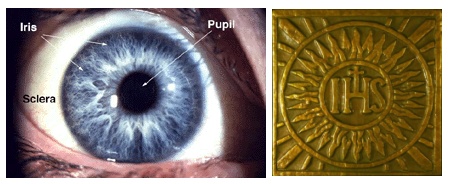
In a wider view of the brand imagery, this male "package" includes the letter J, comparing to the Jiffy Lube version.

Notice how the head of the long arrow forms part of the letter E. Consider the last three letters - EYS. In some fonts, what we know here is an S is actually the letter E. EYE! See it? It's not really that subtle.

If we take it as plural, where are the eyes? There are three.

Occupying the central position of the word, the letter R with its extended leg and the arrow piercing its "eye" is the wedjat Eye of Horus, the third eye. Bracketing that anja chakra "bindi" eye of enlightenment are the other two eyes.

The right eye (on our left) is framed as suggested by the arc of the stylized letter U. This eye has as its pupil the letter O, from which proceeds four arrows. There is the evidence of sex magick in this dynamic and focal region of the graphic. The O with an X inside is a transdimensional portal of the female gender, pictured with projecting arrow seed. This symbol is also a solar cross replete with rays of white light.

The left eye is framed as suggested by the arcing letter N. EYE

As a compass direction, the long arrow points eastward, which is the direction from where the Messiah will be coming. (Ezekiel 43:1-5) The phallic arrow of Journeys signals the coming antichrist Beast aka Horus.

The Journeys kidz brand is a playful image that anyone accustomed to diapering little boys should recognize. The little arrow is peeing - LOOK OUT! This dynamic is connecting with an arrow of the Journeys logo to signal us that those arrows should be considered as adult versions.

[update: 5/29] The letter k in "kidz" is a drawn bow. The arrow being fired is revealed by the shadow it casts, the gray arrow at its base. While the form of the arrow is presented in shadow, what is shot from the bow appears as we consider the i next to the k. The dot of the i is the "red sun" "i" of Horus, the pyramid's capstone, his seed. The z that has been substituted for s (kids) signals Zeus, testifying that "kidz" means the "kid" belongs to Zeus. Apollo, aka Horus, is the son of Zeus. Beyond that, it signifies that the kids who wear the brand belong to Zeus. "I'm Zeus' kid," it declares.

The brand for young women, shi, has two dots over the i. Comparing to the signal anatomical arrows, the two dots are breasts. If you consider the highlighted "i" in the fashion that has been the custom in this series it would signal the "i" of Horus. However, given the obvious female gender we must identify this branding with Horus through his mother Isis.

The shi branding has been around for a very, very long time. In one guise, you'll recognize it more readily if the letters are reversed and capitalized, like in this image.
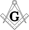
shi = IHS

The two dots are breasts, and eyes.

The Journeys brand family tells the tale of this epic journey. Behind the three in the header, JOURNEYS, kidz and shi are Osiris, Horus and Isis, the ancient Egyptian trinity.

I'm not one of those people who thinks everything occult resolves to the direct covert involvement of the illuminati or Freemasonry, but sometimes it does. That seems to be indicated here.
Every journey that has a destination requires some form of navigation. There is a reason to connect the Journeys logo with the primary symbols of Rosicrucians (rose+cross) through the compass rose that is also a solar cross. You will note that the O in the Journeys logo closely resembles the O in the official AMORC branding. There is also a definite link to a primary symbol of the Masonic Lodge, the compass of the compass and square. There are two kinds of compass used on journeys as navigational tools. One is magnetic for indicating direction and the other is the divider used for measuring distance. The familiar square and compass are used in the building trade but also for navigating. The Order of the Rose Cross and Freemasonry have been all about the journey of man that follows Lucifer as the great architect of the universe, so called.

The parent company of Journeys and its companion brands, Journeys for Kidz and Shi, is Genesco, headquartered in Nashville, TN. Nashville happens to be the home of a full scale replica of the Parthenon in Athens, Greece. Inside is found an 41 foot tall gold gilded idol, the goddess Athena Parthenos. Nashville is considered (William Henry) to be among the most occult cities in America.

In closing, here's a video you may find interesting. Esoteric Adventures in Nashville

Thursday, May 26, 2011

Part 33 - See, it's the "i" of Horus! Sprint - A Phallic Arrow Brand


Continuing the survey of Horus-Eye symbols, I puzzled over Sprint's logo for a while before the Lord put me on to the Phallic Arrow Horus Eye class. I had considered it might be an Aphrodite shell but wasn't really convinced. As I'll explain shortly, it is that, but the dominant symbol is a phallic Horus Eye.

Update: Or perhaps the dominant symbol is the XO mark of the beast symbol, with the t in Sprint as the tau cross, encircled as suggested by the arc of the feathering.

Sprint's logo is an arrow. The arrow points to the right with the yellow graphic elements forming the head and the company name forming the shaft. The head appears feather-like, alluding to an arrow's feathered tail.

The Sprint Logo is also an eye. Picture the word "Sprint" inside the oval defined by the arc formed at the near edge of the arrowhead. Picture that yellow graphic as the corner of the eye, the right eye. The i in Sprint may be considered as the "i" of Horus, which is a sun colored eye filled with white light.

The version that appears on their Web site header today is what you see in the upper right in this collage at left. The registered trademark symbol as a dark left eye creates an instance of Harmerty, or, Horus, "who rules with two eyes." Sprint's stylish logo is a phallic screw arrow Eye of Horus!

The Eye of Horus identity is strengthened by the NASCAR Cup Series branding, whose primary sponsor is Sprint. To me, that image resembles a serpent's head, a copperhead snake. Inside the eye, the backslash lines echoing the N are like arrow fin feathers, just angled the wrong way. Perhaps the arrow would be too obvious if they put NASCAR's brand under Sprint instead of over to present the fin in proper alignment.

When I consider the "Sprint ahead" branding it occurs to me how they are leading us, directing us to see the graphic as a-head. It is an arrow head, yet, interpreting the symbol in the context of Horus Eye reproductive signaling it is the glans penis. Sprint a[penis]head. As I noted in a similar recent post this brand is another one-eyed monster.

Now, I don't mean to be crude but there's only so many ways to describe this brand. Sprint resembles Spurt if you Squint, which is the dynamic presented in the "Sprint ahead" imagery. If you can accept that dynamic, the peculiar image of the sun I included in the collage will make sense. Visit Sprint.com today and you'll be greeted by a scene that features that image. (This scene advertises the Samsung "Replenish" phone, which is rather an appropriate name for the setting.) If you can accept the Sprint Spurt identification you should recognize the solar Sprint Splat. Hey, don't blame me, I couldn't make this stuff up! Now then, if you have male seed you mate it with female egg, right? Sunny side up! That's diner lingo for a fried egg that looks just about like that. If you don't get it, the yolks on you. :)

But seriously, it really is what it looks like. Since you and I and everyone we love are targeted in this alien retrofit scheme that attends Eye of Horus imagery, it behooves us to acknowledge what things really are, even as difficult as it may be to accept. We are being preyed upon by masters of deception. We may use the services and goods of those who are complicit, but becoming free from the spells of deception helps enable us to discern where and when to draw the lines of association. The Lord who is the Sun of Righteousness will arise with healing in his wings, but first comes another, one who bears the image of a flying solar disk and is variously known as Horus, Apollo, or a host of other names.
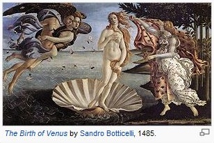
I wrote earlier that this logo was a shell signaling Aphrodite, aka Venus. The yellow graphic resembles the scallop shell that is this goddess' most familiar trademark. (The Shell Oil Company brand features a similar composite sun-shell) In connection with Aphrodite, her male lover Hermes/Mercury is also in view, represented in the yellow graphic by his trademark wing.

Sprint. It's a simple, elegant and powerful evil branding! This spell-casting symbol actively promotes Eye of Horus illumination and advances the mark of the Beast agenda. Sprint ahead, indeed!

Monday, May 23, 2011

In The News

Excerpts from "Radio host says world's end actually coming in Oct" that may be sung to the tune, Hokey Pokey.

Camping, who made a special appearance before the press at the Oakland headquarters of the media empire Monday evening, apologized for not having the dates "worked out as accurately as I could have."

Through chatting with a friend over what he acknowledged was a very difficult weekend, it dawned on him that instead of the biblical Rapture in which the faithful would be swept up to the heavens, May 21 had instead been a "spiritual" Judgment Day, which places the entire world under Christ's judgment, he said.

The globe will be completely destroyed in five months, he said, when the apocalypse comes. But because God's judgment and salvation were completed on Saturday, there's no point in continuing to warn people about it, so his network will now just play Christian music and programs until the final end on Oct. 21.

"We've always said May 21 was the day, but we didn't understand altogether the spiritual meaning," he said. "The fact is there is only one kind of people who will ascend into heaven ... if God has saved them they're going to be caught up."

I believe this scenario will play out with increasing frequency as confusion and the necessary disinformation and persecution agendas ramp up over the next few years, though much of it will be overshadowed by crisis.

Square processing $3 million in mobile payments every day (appolicious - 5/23/2011)

VISA launching ‘digital wallet’ for U.S. banks (Reuters - 5/12/2011)

Karotz: The RFID Rabbit That’ll Monitor Your Home (Vigilant Citizen Blog - 4/27/2011)

Saturday, May 21, 2011

Part 32 - See, it's the "i" of Horus! The Occult Signaling of Amazon.com

Are we all present and accounted for? Sure. False alarm on the Family Radio "rapture." It's a good thing because we're just not ready for harvesting yet. The real harvests, when they come, will each be right on schedule. When the Lord comes for His Bride she will be robed in white, ready for her Bridegroom!

There's a few more examples of phallic arrow imagery I'd like to present in this expose on the Eye of Horus. I'll only address one logo in this post, one that belongs to a world changing giant, Amazon.com. This company is the largest online retailer in the US. Their Internet sales revenue was almost three times that of the next largest, as of January 2010. Their logo and tagline seem simple enough. The arrow points from a to z in an obvious reference to their vast range of products. The tagline "and you're done" suggests that their site is the only e-commerce shop you'll need, that you won't have to go anywhere else. The company name is purported to refer to the river that is the second longest in the world but largest in volume, the Amazon in South America. All that seems plausible, but that's not what they signal.
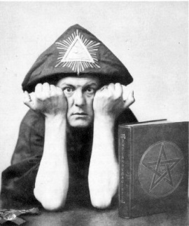
The company began under the name Cadabra, Inc. Clearly referencing Abracadabra, this word has well known magical associations that go way back in history. Aleister Crowley, updating it with the change of one letter, declared that Abrahadabra is the “establishment of the pillar or phallus of the Macrocosm…in the void of the Microcosm.” We're talking about a sex magick spell. It has historically been linked to healing but the greater signification appears to be a healing from death as in regeneration, the Osiris/Isis/Horus transformation. So, when founder Jeff Bezos swapped that name for Amazon do you suppose he abandoned the sex magick, trading it for the mere name of a big river? I don't buy that. His giant amazon.com is a commerce site. He's identifying it with Mystery Babylon, the mother of harlots and great city of Revelation 17 and 18 through the connection with a watcher/Nephilim race of warrior women who dwelled in Scythia near to the Black Sea. The logo's occult signaling is consistent with this context.

The book of Revelation declares how that the merchants of the earth have become rich by the wealth of her sensuality." Judgment will visit her with destruction "because thy merchants were the great ones of the earth, because in thy sorcery were all the nations led astray" There's the magic of Cadabra, Inc. still in effect at amazon.com.

The flesh colored arrow with its suggestive stylized head belongs to the Beast. The beast's phallus appears under the word "amazon" because, as Revelation 17:3 declares, the woman was seen sitting on the beast. On, like amazON. The Z under which the glans appears stands for Zeus, like with Verizon's called-out Z. The arrow extends out from the letter a, which stands for Apollo. The phallus is his. As the name Amazon comes from the Greek, the Greek names of the gods Zeus and Apollo are appropriately referenced. Apollo is Horus in his Egyptian alias. The arc formed by the arrow suggests the elliptical shape of the eye and is sun colored. It's the eye of Horus, another phallic eye variant. That explains why the registered trademark symbol is included. It's a dim left eye added to create an instance of Harmerty, of Horus, "who rules with two eyes."

Because the messianic "antichrist" context has been exposed you can now relate the letters a to z to their Greek equivalents, alpha and omega, and the declared identity of the genuine messianic Sun of righteousness.

10) I was in the Spirit on the Lord's-day, and I heard behind me a great voice, as of a trumpet, saying,
11) `I am the Alpha and the Omega, the First and the Last;' and, `What thou dost see, write in a scroll, and send to the seven assemblies that [are] in Asia; to Ephesus, and to Smyrna, and to Pergamos, and to Thyatira, and to Sardis, and to Philadelphia, and to Laodicea.'
12) And I did turn to see the voice that did speak with me, and having turned, I saw seven golden lamp-stands,
13) and in the midst of the seven lamp-stands, [one] like to a son of man, clothed to the foot, and girt round at the breast with a golden girdle,
14) and his head and hairs white, as if white wool -- as snow, and his eyes as a flame of fire;
15) and his feet like to fine brass, as in a furnace having been fired, and his voice as a sound of many waters,
16) and having in his right hand seven stars, and out of his mouth a sharp two-edged sword is proceeding, and his countenance [is] as the sun shining in its might.
17) And when I saw him, I did fall at his feet as dead, and he placed his right hand upon me, saying to me, `Be not afraid; I am the First and the Last,
18) and he who is living, and I did become dead, and, lo, I am living to the ages of the ages. Amen! and I have the keys of the hades and of the death.
Revelation 1:10-18

Yes, amazon.com is making a blasphemous statement and casting a spell of adulterous and idolatrous sorcery. Horus aka Apollo is a poser. He was and will be, and the dragon will give him power, but it will not endure. He may be an a to z but he is not the First and the Last, the alpha and omega. Not even close.

Another alusion to the sun appears in the peculiar amazON.com branding in that "On" was a city in Egypt where the sun was worshiped. In Greek it was known as Heliopolis, "city of the sun." The phallus appearing with On is an amazingly fitting image, given how the obelisk was the prominent feature in that city. "Several of the obelisks in Rome originated from Heliopolis, as did both the Cleopatra's needles in London, and New York." (ancient-wisdom.co.uk.) You can see several of those that have been relocated to Rome pictured at this Wikipedia page.

Here's a very important signification. This city is from whence the bride given by Pharaoh to Joseph, son of Jacob, came.

And Pharaoh called Joseph's name Zaphnathpaaneah; and he gave him to wife Asenath the daughter of Potipherah priest of On. And Joseph went out over all the land of Egypt.
Genesis 41:45

Joseph was a type of Christ and Asenath, a type of the Bride of Christ. Thus, we see the subtle suggestion of amazon as daughter of the priest of the sun god and bride of AntiChrist!

The Amazones (which you can read about here and here) were brutal and aggressive women who loved war and fighting. You can make the connection with the biblical Jezebel, queen of Israel and wife of King Ahab, and to the spirit of seductive control that claims as her victims so very many among us today.

When you consider the amazon.com branding you can now interpret the tagline in the covert context, with transformational sex magick and the mark of the Beast in mind. ..."and you're done." Stick the fork in you, the trident pitch fork, right?

Jeff Bezos. We're on to your scheme. Your knee shall bow to the sovereign God. Every knee shall bow.

In closing, although it's somewhat off-topic, I wanted to share a video I discovered that relates to some posts I've done about the star that is implicit in the flag of the U.K. British Flag 666 Matrix - Antichrist and the Union Jack

Friday, May 20, 2011

Celestial Signs: Massing of Planets - and May 21 "The Rapture"? Harold Camping and 1994

There are two current events I want to address, the planetary massings in the east, plus Harold Camping's declaration that tomorrow as I write, May 21, is "the rapture" date, to be followed 5 months later by something like the end of the world as we know it.

First, Camping's expectation. I would bet my life it won't happen that way. This is not because "no one will know" when such events will occur, because some certainly will. It's not because Harold Camping is not mainstream or accepted by what is considered mainstream christianity because the biblical declaration is that what we consider mainstream will necessarily be deceived in the matter, which reveals that those who will know will be considered "fringe," mavericks. Why am I so sure? I know this will sound like a foolish statement to most folks but one can only really be certain of what and when something isn't when one knows what and when something is. I've already written at length about these matters, and I suspect a series of blog posts will be forthcoming before long but this is not yet the beginning of such as that.

Harold caused a similar stir back in 1994. I was very aware of it at the time since my buddy "Uncle Stew" Mulligan was fascinated with his radio presentations and had an interest in Camping's book titled "1994." If you're familiar with The Open Scroll and Beyond The Veil you know that what began for me now 20 years past had taken me to a place of being pretty knowledgeable about times and seasons by 1994. I had a substantial basis by which to discern Camping's reasonings and considered evidence. I judged it as wholly flawed, containing nothing of legitimate value. When the targeted time came and went, Harold Camping did what many of you would recognize as a familiar routine. He back-pedaled, found another gear and kept on pedaling and peddling to come back and do it again. I have nothing to say about the validity of any particular claim he now makes because I have no idea what supposed evidence or reasonings have been put forth. Sunday the 22nd, expect another round of what followed in 1994.

Regarding the massings of planets near the rising sun, the 21st (Camping's targeted day) stands out for me as the day of peak interest with regard to the arrangement of the planets. This is based upon my historical observations of two very substantial celestial signs. As yet, I don't claim having revelation insight about what it means, though I will share some suspicions.


Early this morning I drove to a place where I could see the planets. I didn't take binoculars and could only see Jupiter and Venus. You can see them in this picture if you look hard enough. It was a spectacular scene! The sky was already brightening when I came to where they could be spotted. I live not too far west of a mountain range so I have to get fairly high up to see anything much in the rising.

14) And God said, Let there be lights in the firmament of the heaven to divide the day from the night; and let them be for signs, and for seasons, and for days, and years:
15) And let them be for lights in the firmament of the heaven to give light upon the earth: and it was so.
Genesis 1:14-15


This event reminded me only vaguely of when I watched the sign of Genesis 49:10 unfold back in 1991. There are some similarities and there are notable differences that I'll relate to you but I think it's particularly helpful to offer some context right up front. Because the celestial sign of 1991 already established the time of Y'shua's coming in judgment, any other celestial events do nothing to alter that but surely do fill in the gaps on related activity.

That needs to be set forth here because so many people are looking for signs in an attempt to discover when Jesus is coming. I never did that. I was sincerely looking for the day of my Lord's coming but not for knowledge of when the day would be. I had been sold on the notion that no one could or would know that, and, not knowing any better, had accepted it. I had also been disciplined in the notion that signs follow believers, and not the other way around. I'm still ok with that. :) When the Lord presented me with the celestial sign there was no denying that He had brought it because the whole of the matter was consistent with His dealings with me from the beginning. I wasn't looking for a sign, but I was ready for what He brought me to, prepared and equipped. Those who reject that sign seek another. As for me, when I look for something I stop after I'm convinced that I've found it. Sane folk are just that way, you know.

I've observed that some folks who don't acknowledge the sign just seem to have to be the one to bring it themselves. Some may think this about me, that I have to be the one. Think what you will. I'm wrong or I'm right. This is more about you - what's your call on the sign? What's your call on what it means? It matters!

This animation represents the activity surrounding the sign of Genesis 49:10, observed in 1991.

I mentioned some similarities and notable differences with other signs. Here's some observations. The signs of Y'shua's birth and His coming in judgment were preceded by a massing of planets in Leo and the configurations that followed were described in detail in the scriptures. Earlier this month, the same four planets, Jupiter, Mars, Mercury and Venus massed in one constellation, in Pisces. The massing preceding the other signs occurred in Leo, in the Fall. The sign marking Y'shua's birth is described in Revelation 12:1. The sign of His coming in judgment is described in Genesis 49:10. If there is a sign happening now that's described in the scriptures, I just know that I don't know it.

The most interesting configuration I see is in the sky today and tomorrow, in the region of Aries near Cetus. Pursue it further according to your own interest at the Lord's leading. You'll find what Bullinger has written of interest, but don't read this like the Bible. D. James Kennedy did a presentation on the subject years ago that was a vast improvement in some regards, but neither is his work authoritative. The holy spirit - accept no substitute for the leading that leads no one astray. As another resource, I like Sky View Cafe a wonderful online interactive planetarium.

1) The heavens declare the glory of God; and the firmament sheweth his handywork.
2) Day unto day uttereth speech, and night unto night sheweth knowledge.
3) There is no speech nor language, where their voice is not heard.
4) Their line is gone out through all the earth, and their words to the end of the world. In them hath he set a tabernacle for the sun,
5) Which is as a bridegroom coming out of his chamber, and rejoiceth as a strong man to run a race.
6) His going forth is from the end of the heaven, and his circuit unto the ends of it: and there is nothing hid from the heat thereof.
Psalm 19:1-6

Finally, my suspicion about what the planetary configurations might mean. War. The planets are not engaging with prominent nearby stars so while there's nothing brought into the narrative by that means it doesn't mean there's nothing being said. The three planets involved are Mars, Venus and Mercury. As I understand it, Venus and Mercury are the customary attendants giving a birth announcement. Mars - Michael - war.

The only revelation insight I have about a ram (which is what Aries represents in zodiacal pictograph and by interpretation of known star names) relates to Daniel 8. I've written at length about this chapter as pertaining to America in the latter days as the shaggy goat and conflicts with Iraq and Iran. After America has broken the power of both kings over these lands, America's own power will be broken. I've been expecting the second then third kings to fall for some time now, since Saddam Hussein fell.

As for Cetus, the sea monster, I relate this zodiacal decan to the Beast of Revelation 13 seen rising out of the sea. This too relates to America, this Atlantis (Francis Bacon, John Dee [Chris Pinto]), out of which will appear that very Beast.

Ominous? Yes. Am I suggesting the possibility of the lawless one being revealed now? No. The thirteenth day of the first month came and went already. Neither is it the right year.

I'll leave this to your further study, as the Lord leads - and we shall see what we shall see as we watch together in the Lord.

Wednesday, May 18, 2011

Part 31 - See, it's the "i" of Horus! The IN-N-OUT (B)URGE(R)

Picking up from the previous post, out here in California there's a popular fast food franchise whose brand imagery has some pop culture history. When I arrived in California as an East Coast import back in the late Summer of 1983 I noticed bumper stickers that had obviously been altered by the drivers.They presented what you see in this image at left. IN-N-OUT URGE. This was a clear indication that I had arrived in sunny Californi-cation.

It was a month or so before I really paid attention to these, discovering that they were promotional items for a local franchise called IN-N-OUT BURGER. This cultural phenomenon of the modified logo is another example of folks grasping the superficial sexual signalling of a brand. Do you think the folks who named the business and the brand professionals who designed the logo didn't realize they were stamping every instance of their promotional imagery with an inducement for procreational lust? Of course they did! Evidence of that can be seen in their other trademark image, the two palm trees.

Every location I have ever seen has two palm tress that form an X. What to you get when you cross an elephant and a rhinoceros? Elefino. :) But I do know what's signified when I see two trees crossed in connection with that sun-yellow phallic arrow. Have you read what I've written about what happened in the Garden of Eden when Adam and Eve engaged with the serpent? What happened in a figure when Eve ate of the fruit of the tree was a genetic cross between two trees. Cain was conceived, the first hybrid, a cross between two trees that represent two genetic lines. This crossing of two trees is what Genesis and the resulting Flood of Noah's day was about. In our day, the crossing of two trees is going to manifest in what is referred to in Revelation 13 as the mark of the Beast. It will first manifest as the Beast himself - then as those spawned through taking his mark and becoming transformed.
The X is a common emblem for Christ, as in X-mass for Christmas. The fast food franchise's version is the Antichrist version. The X is also a symbol of the chromosome, signaling the genetic transformation of the DNA as the two "trees" are crossed. The X is also a dimensional gateway construct signaling passage between the earthly and heavenly, marking the intersection or union of the sons of god with the daughters of men as the up and down deltas pictured connect. The trees reveal the meaning of the arrow with no ambiguity.

The phallic arrow sign matches to the brand's other featured imagery, the crossed tree, the female contribution in reproductive biology, the X gamete.

The brand's arrow is sun-yellow, signifying that the phallus belongs to the sun god Horus, aka Apollo.

The arrow's bend makes allusion to Freemasonry and the compass of their famous square and compass pairing. The Masonic square and compass in standard configuration can be recognized as picturing the sex act. The female square is on her back while the male compass is in the superior position. The bent arrow of the burger franchise mimics the compass but is rather the "third leg."

They have a drive through. In-n-out. Like Jiffy Lube.

What I mentioned about Subway and BK and John 6 applies here too. Food is the eater as a father is to a son. The point I'm making is that you and I are being played. We have been deceived. This imagery is no harmless joke. Ritual sex magick is real. Revelation 18:23 is true. See what you're looking at. It matters.

Tuesday, May 17, 2011

Part 30 - See, it's the "i" of Horus! Phallic Arrow Brands

The arrow as penis symbol is important to recognize because the intent behind it goes beyond adolescent humor and a superficial reference to natural sex. The greater signification is to the serpent's family plan for hijacking the Creator's heritage. This class of symbols is about the union of the sons of god with the daughters of men that is the subject of Genesis 6, what was - and what will yet be.

This logo for KegelMale.com features the arrow that compares closely to the familiar Mars/male gender symbol. It's leveraged overtly as a legitimate graphical representation of their business. It's about the penis, and the arrow obviously represents the penis. While there's nothing sinister about that, the K is being called as a X/H/K Kromosome signal by the "privy member of a horse" size (Book of Enoch 86:4), plus the male member enhancement business implicates them as participants in the scheme.

I don't see anything particularly sinister about the Arrow brand of clothing and their representative graphic. However, most brand imagery with arrows has a covert agenda that is revealed by the accompanying imagery. I addressed Valentine's Day, Subway, NOS and FedEx imagery already. To help you see what you're looking at in more subtle examples I will present some of the more obvious first.

Closely resembling the male gender symbol, Volvo's logo is merely more "modest" in comparison. Given that the name Volvo is so similar to vulva (which is why someone made the related image I've included here), the attachment of the penis to the feminine circle shape may be seen from one perspective as an attempt to offset the femininity of the horizontal divider that bears its inherently feminine name. From another perspective, this logo is less about balancing the gender weighting than creating the male+female Hermaphrodite/Baphomet fusion that is so common in occult signaling, a dynamic that ultimately signals the union of the sons of god with the daughters of men.

The Volvo logo is a Horus-Eye sunrise emblem with a solar circle, a horizontal divider as the horizon and the arrow suggesting its rising.

The logo for Sunoco (formerly known as Sun Company and Sun Oil Company) is a Horus-Eye brand in name and by visual imagery, featuring a sun colored angular eye shape replete with some ray-like protrusions. It also features a red phallic arrow penetrating the feminine horizontal. The female aspect is more succinctly identified for us in their latest logo by drawing out two horizontal lines.

The Sunoco folks take their Egyptian sun god worship seriously, as you might expect from their company name and brand imagery. Their headquarters are located in the BNY Mellon Center in Philadelphia, PA, in the tower topped with a pyramid. On the 52 floor, marking the number of weeks in a solar year, is a private club known as the Pyramid Club. The building's address is known as Nine Penn Center - yes, that's the single digit number for the mark of the Beast transformation. Philadelphia - that's where you'll find the Masonic Temple that is the headquarters of the Grand Lodge of Pennsylvania, the lodge of many "Founding Fathers" and signers of the Declaration of Independence like George Washington and Benjamin Franklin.

Another red arrow brand is Jiffy Lube. Once you see this as male genitalia it's hard to imagine how we could have "not seen" it for so long! The vertical is a male signal element, which certainly does nothing to detract from the male-ness of the other bits but adds significantly to the symbol by providing the necessary cover of obfuscation. Jiffy Lube. Think about it. If they had called it "Quickie Sex" would that have made it easier to see?

In the latest iteration of their logo you will observe how the genitalia has been made less apparent. It has been placed inside the female circle. There had been a bullseye/target style Horus-Eye in the scrotum, with the eye appearing appropriately right under the letter i. The eye is in the big red sun now, so the emphasis has been shifted slightly to focus upon the sexual union and to clarify the Horus identity.

You're starting to see how this has all been paraded about while we've been sleeping, bewitched under the Horus-Eye spell, right?

Saturday, May 14, 2011

Odds and Ends - New Video: NCR Series plus Lady Gaga's Phallic Footwear

The NCR series I blogged back in November and December of 2009 is something of a primer for the "Occult Mark of the Beast Signaling" theme that has been a mainstay of this Blog. I was disappointed when NCR replaced the marketing sequence and made the one I referenced inaccessible. It was useful documentation, much better seen than just described with some words and little static images. Not only was it helpful to see the actual animation I referenced but it was also confirmation that I wasn't just making it up. Well, fortunately I had saved a screen capture of the animations - and it's now published to YouTube!

Secrets of Occult Symbolism - NCR


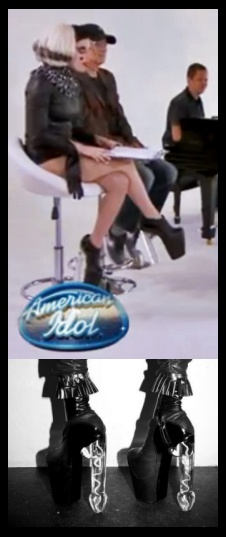
In the news yesterday, Lady Gaga, even though I called her on her recent "jumping the shark," revealed that she's a good sport by continuing to provide relevant subject matter for this blog. ;) She was featured on American Idol wearing controversial footwear on this Blog's current penis theme." Lady Gaga wears phallic boots on 'American Idol'; Show producers cover up naughty bits with logo Quoting NY Daily News: "Lady GaGa black leather boots, made by the British label Void of Course, feature a sky high platform and a pair of anatomically correct Lucite heels."

On the subject of LG in the news, almost a week ago this item came up on MTV.com. Lady Gaga HBO Special Gives Fans A Taste Of 'Marry The Night' Another one of the songs like "Judas" that came through the portal with "Born This Way" is "Marry the Night." Previewing the lyrics: "I'm gonna marry the night/ I won't give up on my life/ I'm a warrior queen/ Live passionately tonight." Does anything further really need to be said about that?

On that same MOB (Mark of the Beast) theme, here's an interesting article. A Game of Tag Implants and electronic harrassment (ForteanTimes - May 2011)

I featured a brief series of posts with Stars on Top a while back. A friend brought this one to my attention recently and it was just so special I had to share with you. It's a mall, of course, where it's all about commerce, except where it's about working you over with spells so you lose your soul to the fallen star and stars!

Note the triple-helix DNA signaling wavy lines. Note how the over-sized A in America is leveraged as a pyramid by appearing under the star / capstone. The Star is Apollo aka Horus.

Here's a video I made that has some related insight.

A Sign From God - Chilean Miner Rescue - The Real Witness of the T-Shirt

Friday, May 13, 2011

Part 29 - See, it's the "i" of Horus! FedEx Hidden Arrow and Healthways' Triple Target

In recent posts in this survey of Horus-Eye imagery the stylized heart and arrow as symbolic of genitalia have been introduced with examples from the branding of NOS, Subway and what you see marketing the pagan fertility festival Valentine's Day. This post features the hidden phallic arrow of a major Eye of Horus brand plus an exceptional example from the health/disease management/medical industry of the target(s) for such arrows!

Did you ever notice the arrow in the ubiquitous FedEx logo? The white arrow appears so naturally in the negative space between the E and x that it's seldom recognized. Among those who are aware of its presence few understand it as a penis, and fewer still as the privy member of Horus that it most certainly is. Let me explain.

In the collection of FedEx brand images at right the one on top is probably most familiar. As they have expanded their business beyond the shipping industry and necessarily their branding, the purple and orange color theme has been retained by their legacy business, renamed FedEx Express. The second image down is a familiar transitional branding. FedEx bought Kinko's in 2004 and used this imagery before rebranding it as FedEx Office in 2008, although the implementation of the rebranding may yet still be in progress. The third and fourth brand images of their print and ship services chain can be found today on their Web site.

What makes the legacy version an Eye of Horus variant is subtle. The reality that it is should become apparent momentarily - bear with me. Sun symbols come in many forms. The orange of the letters E and x identify the arrow's container as the sun. That's the central feature of the logo because the other elements surround it. While the shape of "Ex" isn't rounded, the sun color plus the arrow inside assures me that it's an Eye of Horus.

You're wondering, "How is the arrow an eye?" Like many symbols, to visualize what your mind sees subconsciously and what is intended to be presented requires considering it from another perspective. Think 3D. How does a cone-headed arrow look when it's coming at you? The point is a dot and the edge of the cone is a surrounding circle, forming the bullseye-target Horus-Eye!

The Horus eye connection appears on another, more vulgar level. There is a slang term for the penis you may have heard; one-eyed monster. The arrow as a penis makes it a "one-eyed monster." The FedEx penis is the eye of the monster or beast Horus. Think about it.

Convincing evidence that FedEx is a Horus-Eye brand comes from their Office imagery. Consider the logo on the bottom, the current FedEx Office brand. The most significant difference you'll notice as you compare it with the others is that the hidden arrow is missing. It's no longer necessary because the new design is more powerful without it. It is now an instance of Harmerty, or, Horus "who rules with two eyes," comprised of an oversized registered trademark (darkened left eye) balanced opposite the bright solar eye. If the arrow had remained it would have diluted the impact and influence of the powerful Horus symbol. The other two iterations shown retain the hidden arrow and familiar legacy brand shape, yet, having given up the orange in exchange for a non-sun-color, that symbol's influence is compromised, vastly diminished. For those who "get" the Horus brand, the bottom logo's oversized registered trademark symbol just shouts HARMERTY in your face!

FedEx Office's solar eye symbol is a substantial example with layers of signification, signaling the Eye of Horus illumination that will be the mark of the beast transformation. The union of the sons of god with the daughters of men that will result in a triple helix DNA upgrade is pictured in the triad of orange, green and blue elements. They represent Isis, Horus and Set or Osiris. The elements resemble a triquetra, showing their union at the center, and a triskelion, rotating around a hub. The six pointed star figure I've addressed before, as stars figuratively represent angels. The FedEx Office solar star hides a hexagram and the Star of David style overlaid opposing deltas.

Is FedEx Horus branded? Is the hidden arrow in their FedEx Express logo the penis and Eye of Horus? That's affirmative.

21b) Thus with violence shall that great city Babylon be thrown down, and shall be found no more at all.
23b) for thy merchants were the great men of the earth; for by thy sorceries were all nations deceived.
Revelation 18:21b,23b

Now, arrows are all about targets. I had supposed Target's bold corporate logo pretty much ruled the dot-in-circle corporate Horus-Eye roost but that was before I saw the Healthways logo. Target has been one-upped, or perhaps two-upped!

The red elements are the familiar dot-in-circle sun Eye of Horus but what are those blue elements all about? Think - anatomy. Think - targets for arrows, penis arrows. The graphic is indeed graphic. This has all the modesty of a hospital gown! I have to wonder about Healthways. Do they specialize in proctology or gynecology, or both?

How can it be that folks don't see this? Ahhhh. The sun is in their eyes. Surely. Really, though, all those professionals trained in anatomy. All their clients and partners and vendors... Does no one see what they look at? "In 2009 Healthways acquired HealthHonors, a behavior economics company that specializes in behavior change science and optimized use of incentives." (Wikipedia - Healthways) I bet those behind this branding know exactly what they have, why it works and what it means - and what it does. This hearkens back to the Garden of Eden - BIG TIME!

As a sign that some have interpreted their symbol it has been toned down a shade, presenting it on their Web site with a smidgeon of obfuscation by reducing it to black and white. The white and gray divides on the dot, presenting a horizontal line, a female element that also signifies the Hermetic Maxim, "As above so below."

On their Web site next to the logo is the link titled "APPROACH." Can't you just picture someone pulling on some latex gloves and reaching for the K-Y jelly? I have to wonder whether Patch Adams had anything to do with this logo? Do they get crank calls asking reception to page Doctors Mike Hunt and Ben Dover? When FedEx Express services a Healthways facility, how do they know whether they should deliver the goods in the front or in the back? Do they have Starbucks in the lobby and sell Valentines in the gift shop?

I'm not trying to be crude here, but it's actually very important that we both see what we're looking at and consider what activity is involved with brands. I previously expounded upon the example of eating golden fries from BK's serving sleeve that was decorated with a radiant Horus-Eye sun. Occult ritual magick is evidenced when some action is being engaged in association with products or services and the symbolism of the action is consistent with the brand's occult imagery. When FedEx Express drives around making deliveries all over town in their Horus penis branded vehicles, that's occult sex magick.

If you think the Healthways logo is just an innocent prank, or not really what it looks like because "it just can't be," you're still under the spell. There's nothing funny about that.