Sunday, February 28, 2016

Decoding: Pearle Vision and EyeMed


Were you able to decode these brands to find examples of Code 666, XO MOB, Eye of Horus, Third Eye or even more symbolism? Did you perceive Code 33 in the ad copy?

When it comes to vision care, identifying your brand with pictures of the eye could hardly be more natural. However, neither Pearle Vision nor EyeMed chose to represent themselves with pictures of the eye in any obvious way - but only in the way of the Occult!

Perhaps the most obvious is how the EyeMed highlights 666. The wordmark comprises 6 letters. The reflection of each e is a 6, and the 3 of them are grouped together in the design around the Y. The reflection evokes the Hermetic Maxim, As Above, So Below.

Each letter e is elliptical, styled to suggest the Wedjat eye. The Eye of Horus.

Three eyes = the 3rd Eye. EyeMed ~ Med Eye like Middle Eye. The 3rd eye is usually called the all-seeing eye or Eye of Horus.

EyeMed is basically an insurance provider for vision services. They are all about helping you see better - vision enhancement - with the eye of Horus. eyeMED or medicine: Rx. Prescription.They usually deal with prescription lenses, and the symbol for prescription is the Rx, the eye of Horus associated with healing. When you extract the grouped central Y and e eyes what remains is the m and d. MD: Medical Doctor. The prescriber and vision enhancing practitioner.

So, EyeMed name implies the Rx Eye of Horus and their logo features the third eye with 3 subtle instances of the Wedjat.

The triple e that reflects to 666 also signals 666 through another kind of transformation. The form of each e is round, suggesting the circular letter O. O is the 15th letter, and 1+5=6, so OOO transforms to 666.

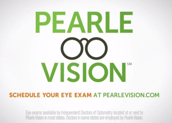
This OOO=666 transformation is also suggested in the way Pearle Vision adds the eyeglasses to their wordmark. Round lens 1 plus round lens 2 plus the O in vision. 666. But, more powerfully than that, as the potency of the esoteric imagery is considered, this style of eyeglasses features a subtle OOO=666 with the arc of the nose bridge connecting the eyepieces to form the 3rd O.

Now, the nose bridge is the arc suggesting a smaller eye located between the two flanking eyes. It's the third eye, the Eye of Horus - the Eye of Ra. The BRIDGE - between god and man, heaven and earth.

A lengthy series of posts on this blog offers examples of how the letter “i” is exploited as the homonym of “eye” to secretly indicate the Eye of Horus. The tell is that the dot is given special attention. Pearle Vision dots the I in VISION with the bridge eye, the third eye. To validate that observation (and magnify the supernaturalism of the pharmakeia), right above that we find the letters AR in PEARLE. This indicates the Eye of Ra. There is no practical difference between AR and RA to Occultsts who have been trained (by such as Aleister Crowley) to read and even speak backwards. To us, because we're not trained that way, the AR (or RE according tho the optional spelling RE) version is less suspect, perhaps. The AR version is more highly obfuscated and, for it's subtlety, is potentially more effectual in their scheme.

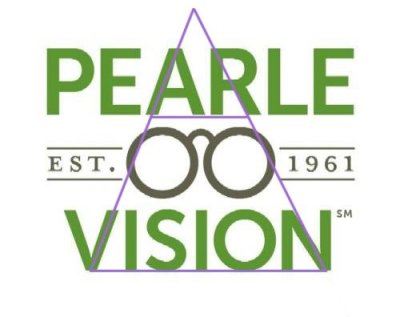
Here's a classic. The Green Pyramid. The most recognizable Illuminati symbol. As you see here, the sides are suggested by the lines through the A and V, the R and N. The horizontals are formed by underlining the words. AR is identified with the capstone - The Eye of RA! RA VISION - with the third eye of the eyeglasses enhancing it further! It's the beast construct, with the capstone being the head in the heights, the beast himself, and the truncated base is his corporate body in the earth.

The EyeMed logo presents a reflected or inverted pyramid with the inherent Eye of Horus.

The pyramid in 3D is a geometrical construct with 3-4-5 element counts. This fundamental of sacred geometry demonstrates the production of Horus in the earth through the union of Osiris and Isis. (47th Problem of Euclid with 3.4.5 Pythagorean triple)


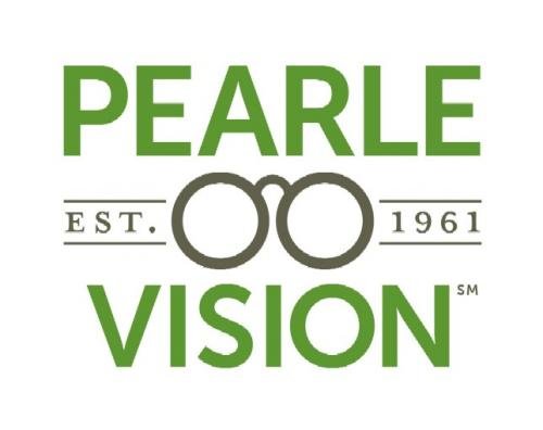
Did you notice XO MOB imagery? The eyeglasses of Pearle Vision's logo present 3 crossing circles. Cross Circle = XO. In sequence, OXOXO. Technically, the T of EST generates another instance as a Tau cross in connection with the lens on our left. (T as Tau cross = X, thus, XOXOXO or XXX woven together with OOO, doubling the 666, because X as the 24th letter makes 2+4=6 and XXX ~ OOO ~ 666.)

The EyeMed logo conceals the XO because the Y is bent or a broken Tau. It's clearly a cross form with 3 arms or radial spokes. In connection with the round letters e, three XO combos are produced.

It seems likely to me that the eYe obfuscates OTO, the acronym of the Ordo Templi Orientis.

I suspect the Y and radial e triad is signaling triple helix DNA - their anticipated MOB Horus EyeMed to splice in their beast “all seeing eye” genes.

According to Kenneth Grant of the OTO, the union of the X and O establishes the celestial throne of the goddess. There's the presence of Isis. She is also present in the identity of the Wadjet eye.

Did you notice how the ad copy of both Pearle Vision and EyeMed contain expressions of Code 33? Eye Exam ~ EE ~ 33. Most Major ~ MM ~ 33. Without the layered symbolism in the context, I wouldn't suspect their intent, but with it, this is additional signaling and it most certainly does add to the sum.

Do you see the Pearle Vision logo as a place of worship?

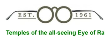
Pearle Vision's logo has temples. In the anatomy of eyeglasses, the sides of the frame that extend over the ears are called temples. The logo's temples are very slightly obfuscated. These are obviously “temples” dedicated to the worship of Ra, or the gods of ancient Egypt, which are the gods of today's Luciferian Illumined.

The parent company of these brands is an Italian company headquartered in Milan, Luxottica. They are the world's largest eyewear company. On the stock exchange they are LUX. Light. Think: Lucifer. Illumination. Luxor, in Egypt, was known in the Egyptian language as, “the southern sanctuary.” The two cult temples located there are famous, Karnak and Luxor. Two Temples - like eyeglasses.

Not unrelated, in the word, VISION are the words, ON (aka Inu or Heliopolis, the Egyptian city where Ra resided and sun worship in the northern kingdom of Egypt was centralized), and SION, aka ZION, home of the Mount and Temple of the One True God. You may also take the IO of VISION as suggesting the Greek spelling of Helios, the sun god aka Apollo, Ra and Horus. It could easily be argued that there are multiple instances of IO encoded into the logo.

The parent company's name, Luxottica, seems to suggest the upscale sense of the Exotic, and also perhaps, Luxor Erotica. Certainly the sex magic of the obilisks featured in Luxor and the age-old illumination rituals celebrated there involve a kind of eroticism. The Illumined are obsessed with sexual reproduction of a certain kind, and reproduction of their illumination through the practice of ritual sodomy.

See both of the featured logos as anatomical diagrams. In the middle of the anal triangle is what Occultists call the Eye of Horus. In EyeMed's version it's the radial triangular Y and triple e. In Pearle Vision's, it's the triangle of the pyramid framing the central bridge third Eye of Horus.

EyeMed ~ Preparation H? Is the M-D a proctologist?

Symbol loving sodomites claim to recognize the letter i as a picture of sodomy. The dot is the anus and the ascender is the phallus. Pearle Vision sees that, apparently!

On that same line, as an ideogram, EyeMed's “Y” becomes the sodomizing “Top” of the “e” positioned underneath it, on the Bottom.

Is that too much of a stretch? Are we just getting carried away and reading into this one what's not really there? Here's another reflection of the EyeMed Logo. Seen in the mirror, the letter e becomes g. This is now a picture of the “g eye” or GI tract, the terminus of which is called the Horus Eye. After removing the G-EYE elements from the stylized wordmark, what's left? BM. That's the acronym code for, Bowel Movement, in medical terminology. To suggest that this might somehow be a coincidence is just not very satisfying.

Through the biological mechanism of sodomy, in connection with ritual magic, Occultists acquire illumination and establish control in their domains of authority.

Pearle Vision. 12 letters. Including the space, 13. The numerics of a coven of witches. The numbers signaling time (12) and the mastery of space and time (13).

The obsession with the anus, defecation and sodomy is common to the Horus Eye illumined mind-controlled and controlling Luciferian elite. They have an “over the rainbow” method of bringing a person in and out of deep trance during programming that features a pearl and seeing or envisioning it. This also has to do with accessing a slave's Horus Eye. The programmer hypnotically guides the slave through layers of clouds in the colors of the rainbow, red then orange, yellow, green, blue and violet. That's where they fix on a black pearl. The script goes like this. “Land very gently ... very softly ... in the center of a round, black pearl. See it glowing, softly, gently.” Pearle Vision? The logo's eyeglasses, between the layers of green as the rainbow cloud layer? (See DEEPER INSIGHTS into the Illuminati FORMULA for Undetectable Total Mind Control - pps 44-46)

“Signs and symbols rule the world, not words nor laws.” ~ Confucius

He knew stuff. The kind of stuff that explains why this was forbidden in the Bible as the 2nd commandment.

Are you catching on? Look around. See the world for what it is. Seek the Lord Y'shua, son of the living God for help. We all need it - need Him!

Saturday, February 27, 2016

Pop Quiz - Decode the Pearle Vision and EyeMed brands

Aaron spotted these ads promoting two brands owned by the world's largest eyewear company. We found decoding their Occult symbolism to be an engaging exercise.

Can you discover what the Pearle Vision and Eye Med images have in common? Code 666? XO MOB? Eye of Horus and Third Eye? Do you see Code 33 in the ad copy?


Do you see the Pearle Vision logo as a place of worship?

Thursday, February 25, 2016

Decoding Rocky Horror Picture Show - Time Warp

This quirky gothic musical has been celebrated for over 40 years. It's a unique global phenemonon. The LGBT bent is hardly subtle, and I recommend that no one should ever watch the film. While this cult film may not have influenced you directly, what it conceals and reveals most definitely has!


When I was researching and the Lord was opening insight during the production of our videos decoding Back to the Future, He highlighted some key connections those producers made with Rocky Horror and the Time Warp. The Time Warp sequence is of particular interest in this season for what beans are spilled, and with the caveat expressed in the video we made, I do recommend watching our video. In Part 1 of what is expected to be 2 parts, we expose it as a celebration of trauma-based mind-control programming and the initiation ritual. Part 2 should pick up where Part 1 leaves off and touch on what else the Time Warp ritual has to reveal about the nature of our time.

Due to blocking polices relating to content rights claims, the video is not expected to be available for viewing on our YouTube channel.

Decoding Rocky Horror Picture Show (Part 1) - Time Warp as Trauma-Based Mind-Control and Ritual

And, here's a link to the series I mentioned: Playlist for “What is Back to the Future Really About?”


At the opening of the Time Warp scene, when Brad and Janet are welcomed in the castle entry, Brad says to Janet, "It's probably some kind of hunting lodge for rich weirdos."

As I was putting the finishing touches on the Time Warp video, the following item came to my attention.

Justice Scalia spent his last hours with members of this secretive society of elite hunters

“When Supreme Court Justice Antonin Scalia died 12 days ago at a West Texas ranch, he was among high-ranking members of an exclusive fraternity for hunters called the International Order of St. Hubertus, an Austrian society that dates back to the 1600s.”

“After Scalia’s death Feb. 13, the names of the 35 other guests at the remote resort, along with details about Scalia’s connection to the hunters, have remained largely unknown. A review of public records shows that some of the men who were with Scalia at the ranch are connected through the International Order of St. Hubertus, whose members gathered at least once before at the same ranch for a celebratory weekend.”

“Members of the worldwide, male-only society wear dark-green robes emblazoned with a large cross and the motto “Deum Diligite Animalia Diligentes,” which means “Honoring God by honoring His creatures,” according to the group’s website. Some hold titles, such as Grand Master, Prior and Knight Grand Officer. The Order’s name is in honor of Hubert, the patron saint of hunters and fishermen.”

It's noted in a video that that the International Order of St. Hubertus is rooted in Catholicism, like many other orders. The US Chapter launched in 1966 at the Bohemian Club in San Francisco. Membership is invitation only. Their branding includes XO, Iron Cross and Cernunnos symbolism.

“Honoring God by honoring His creatures”
So, just thinking this through - If hunting and killing His creatures for sport is how they honor them, is that the same way they honor God - by the sport of hunting Him to "kill" Him?

Sunday, February 21, 2016

Decoding: Indiana Kitchen


Can you identify the seeing eye of Horus in this logo?

IC as Eye See. Harmerty's sun eye - the all seeing Eye of Horus.

IC is gematria code for 93, a special number to Crowley's Thelema and OTO.

As Erin noted in his comment, there are 3 letters "i." As the 9th letter, iii becomes 999 which rotates to becomes 666.

The three eyes, i i i, also signal the THIRD EYE, the Eye of Horus, the all seeing eye.

With the central IC and three "i"s magnifying the seeing "Sun" Eye of Horus this clever logo design is leveraging Harmerty with the Registered Trademark as the darkened "Moon" Eye.

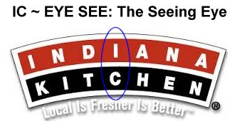
BTW, I-K, the acronym of Indiana Kitchen, happens to be a 9-11.

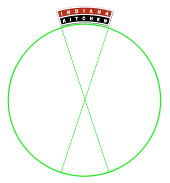
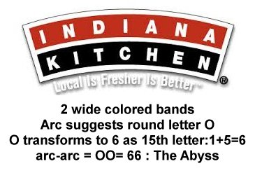
As Erin also described, the pizza slice provides the XO image when the pattern is extended.

The signaling of the goddess did not go unnoticed. In-Diana! Validating this observation is the fact that the Indiana band is colored red, her color. As recorded by the influential OTO's Kenneth Grant, her celestial throne is established by the union of that X and O, in connection with lightning flashing from the abyss.

The Abyss. Code 66 is signaled by the two wide colored bands. An arc extends to imply the circular letter O, which transforms to 6 as the sum of the digits of that 15th letter.

arc-arc = OO=66

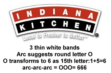
Likewise, the three thin white bands provide for a signaling of 666.

arc-arc-arc = OOO=666

The XO is a MOB symbol, mark of the beast. Supporting that is the 666 of the arc-arc-arc and the 666 of the i i i. Revelation 13:18.

BTW - on the subject of the XO and goddess, a song with 2 Grammy nominations came to my attention as I skimmed through the show. Elle King - Ex's & Oh's. I was curious so I found the official video. Yikes. It's recommended to avoid seeing that.

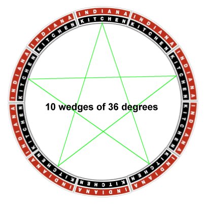
Dimensions are sometimes encoded in what's typically known today as sacred geometry and architecture. That appears to be the case with this deceptively simple logo.

The arc is 1/10th of a circle, 36 degrees. That's the number of the magic square of the sun, the most significant among many to the Occult practitioner. That inherent numbering supports the SUN eye of the SUN god imagery present, as well as the mark of the beast theme. Adding redundancy is the sun wheel design implied by adding the remainder of the implied wedges. With the full compelement of 10, a rotated pair of 5 point stars can be drawn in, connecting them at any uniform point around the circumference. Like for example, at the IC (EYE SEE). This figure is the familiar magic pentacle that is so commonly used on alters where magick is practiced, and on other magical implements. It's the celestial Star of Venus and the ancient Egyptian hieroglyph of the duat, which is the netherworld, underworld or abyss. Redundancy adds potency to the spell behind the imagery, that projects demonic influence through the image.

The numbers that the Occultists associate with the Sun are 6, 36, 111, and 666. There's the 666 again, which is the sum of the series of numbers 1-36 which populate the magic square of the sun. 666 is claimed to be the number of the name of the spirit of the Sun.

Indiana Kitchen - Exalting the goddess and sun god. I suspect the Pope would feel right at home there.

Are you seeing what you're looking at when you're confronted with the imagery that wallpapers our environment? It's not just in TV and movies but nearly everywhere you look. Do you understand, saints, how this world is not your home? Has this awareness become a constant reminder for you? As the days pass so swiftly by, may I encourage you to seize the opportunity to give thanks for this life and lay up treasure for the life that is truly life.


Some Interesting anagrams:

Dine-In Katchina (Katchina: an ancestral spirit)
I Had Ancient Kin
Thine A Cain Kind
In Cain Death Kin
Dietician 'N Ankh
Indicate In Ankh
Hi I Incant Naked
I Chant Kin Diane
Chained Tankini (tankini: a woman)

Friday, February 19, 2016

Pop Quiz - Decode the Indiana Kitchens Logo

Can you identify the seeing eye of Horus in this logo? They are leveraging Harmerty with the Registered Trademark as the darkened "Moon" Eye.

How about Code 666?

How about the XO MOB?

How about the Abyss signal?

Friday, February 12, 2016

In the Spirit of Valentine's Day... Walgreens. W is for Witch, Whore, some ideograms and Wedjat!

16 “Now no one after lighting a lamp covers it over with a container, or puts it under a bed; but he puts it on a lampstand, so that those who come in may see the light. 17 For nothing is hidden that will not become evident, nor anything secret that will not be known and come to light. 18 So take care how you listen; for whoever has, to him more shall be given; and whoever does not have, even what he thinks he has shall be taken away from him.” ~ Luke 8:16-18

You'll see in this post how the Walgreens Pharmacy brand is actively spreading pharmakeia - even aside from their being in the pharmaceutical and cosmetic industry. It's another brand that, like redbox, leverages the color red in the Valentine's Day season to enhance its own brand identity. With this color and some distinctly related symbolism they celebrate the goddess of love, of magic, the bee goddess as queen of heaven, and the scarlet woman, the great harlot, Mystery Babylon the Great. This brand's imagery is very ancient and powerful, signaling even the Eye of Horus that is at the very root of their industry.

This ad that I found on their Facebook page establishes their intent, to those of us who can decode it, and the subtlety of the layering enhances the mind-control factor and raises the harvest of ritual (demonic spirit) energy gained from their magickal practice of theurgy. We'll decode that shortly.

The branding of Walgreens always includes their stylized W. They brought a lawsuit against the Wegmans supermarket chain in 2010 with an assertion that the stylized W they were using was too similar. Wegmans yielded to their demands.

On a very fundamental level, the stylized W they are so protective of features the ancient symbol of the mark of the beast, the heart of the sigil of Nodens, god of the abyss, which is the crossing of circles. The form is evident in the looping vesica piscis-like center of the W. It's the union of the “double U,” as we say the letter. As signaling the union of the X and O, this is claimed by those who should know to represent a divine sexual union and to establish the celestial throne of the goddess. Additional to the loop's crossing circles, the mark hanging off the left side creates another instance for redundancy, effectively crossing the arc of a circle with a potent half Tau on the circumference.

The Walgreens brand has been identified with the color red and the image of a blue mortar and pestle with white stars (replaced with an update in 2006). That version has a subtle patriotic look, with white stars on a blue field, and with the color red it's a theme that resonated with the slogan of their branding: The Pharmacy America Trusts. Given that Walgreens is today the largest drug retailing chain in the United States their slogan made a legitimate claim.

Walgreens logo until 2006It makes good marketing sense to signal the waving of the national flag to attract the patriotic. At the root of that attraction, if you have eyes to see it, is how America's loves Columbia, Liberty and Freedom, all being national goddess identities. The District of Columbia is on a parcel of land that is part of a grant from Virgina and Maryland. VIRGIN MARY LAND. This patriotic theme is very much one of the goddess. The essence of Walgreens' branding goes beyond the patriotic sense - reaching right on through to the goddess.

Here's what FamousLogos.net (DESIGN ELEMENTS, HISTORY AND EVOLUTION OF WALGREENS LOGO ) has to say about it. “The Walgreens logo is one of the most popular logos in the pharmaceutical industry. It has served as a critical aspect in the company’s success and continuous growth. The current version of the Walgreens logotype was introduced in 2006 when the company decided to simplify it and remove the cup symbol featuring fifteen stars, which was a prominent feature of the old corporate logo which typified “magical healing”.”

Note the observation that it typified “magical healing.”

In updating their brand imagery Walgreens dropped the blue color and the star motif but retained their essential stylized W, the dominant red color with the white, and the imagery of the mortar and pestle. Not that many folks these days can identify the mortar and pestle beyond linking it with the Rx, like you see in this screenshot of an old fashioned drugstore from a scene in the animated feature from 1999, The Iron Giant. See it on the window glass?


The mortar and pestle have been used for thousands of years to grind roots and herbs into powder and to mix ingredients together. These may be used in the visual arts for making pigments, or by chemists, cooks - or witches. As FamousLogos.net observed about the Walgreens brand, they may be used for “magical healing.” They are also used for other magical preparations like charms and potions. 
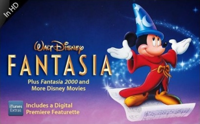
In our culture, Disney has famously used the flowing stars motif to represent magic in such popular films as the classic, Fantasia. Micky Mouse, the Sorcerer's Apprentice, wasn't doing any magical healing but he was certainly casting a magic spell.

What does the Walgreens W signify? One one level, W is for Witch, or Warlock or Witchcraft. Here's a collection of images found when I searched for witch mortar pestle.


Witches still use the mortar and pestle in their homes for the same reasons they always have. These tools of the craft are often inscribed with magickal symbols. And, so is the one Walgreens has presently branded themselves with. W is for Witch.

Walgreens is a pharmacy. The word comes from the Greek, pharmakeia. The word is used in the Bible and is usually translated as sorcery or drug spells, depending on what version you're looking at. (See Pharmaceuticals -The Sorceries of Babylon for more insight.)

19 Now the deeds of the flesh are evident, which are: immorality, impurity, sensuality, 20 idolatry, sorcery (pharmakeia), enmities, strife, jealousy, outbursts of anger, disputes, dissensions, factions, 21 envying, drunkenness, carousing, and things like these, of which I forewarn you, just as I have forewarned you, that those who practice such things will not inherit the kingdom of God. ~ Galatians 5:19-21

21 Then a strong angel took up a stone like a great millstone and threw it into the sea, saying, “So will Babylon, the great city, be thrown down with violence, and will not be found any longer. 22 And the sound of harpists and musicians and flute-players and trumpeters will not be heard in you any longer; and no craftsman of any craft will be found in you any longer; and the sound of a mill will not be heard in you any longer; 23 and the light of a lamp will not shine in you any longer; and the voice of the bridegroom and bride will not be heard in you any longer; for your merchants were the great men of the earth, because all the nations were deceived by your sorcery (pharmakeia). 24 And in her was found the blood of prophets and of saints and of all who have been slain on the earth.” ~ Revelation 18:21-24

I note that a millstone is for grinding, like a mortar and pestle. So, the pharmakeia deceived all the nations, which is to say, cast magical spells that deceived. Deceiving spirits are being deployed and employed. The agency responsible is named as the great city Babylon, in verse 23 above. Verse 24, again, declares: “And in her was found the blood of prophets and of saints and of all who have been slain on the earth.” Blood. Lots of blood. Blood is red. Walgreens Pharmakeia red.

1 Then one of the seven angels who had the seven bowls came and spoke with me, saying, “Come here, I will show you the judgment of the great harlot who sits on many waters, 2 with whom the kings of the earth committed acts of immorality, and those who dwell on the earth were made drunk with the wine of her immorality.” 3 And he carried me away in the Spirit into a wilderness; and I saw a woman sitting on a scarlet beast, full of blasphemous names, having seven heads and ten horns. 4 The woman was clothed in purple and scarlet, and adorned with gold and precious stones and pearls, having in her hand a gold cup full of abominations and of the unclean things of her immorality, 5 and on her forehead a name was written, a mystery, “BABYLON THE GREAT, THE MOTHER OF HARLOTS AND OF THE ABOMINATIONS OF THE EARTH.” 6 And I saw the woman drunk with the blood of the saints, and with the blood of the witnesses of Jesus. When I saw her, I wondered greatly. ~ Revelation 17:1-6

This woman sits on a scarlet beast, clothed in purple and scarlet. The color, scarlet, is a bright red. Those who dwell on the earth are made drunk with the wine of her immorality, and wine is typically red. Verse 6, again, declares: “And I saw the woman drunk with the blood of the saints, and with the blood of the witnesses of Jesus. ” Again, blood is red. Walgreens Pharmakeia red. The branding of Walgreens is identified with the sponsor of pharmakeia. On one level, W is for Whore, the harlot with the golden cup who is drunk on the blood, Babylon the Great.

Cosmetics that are used for beautification represent a very significant part of the Walgreens business, and the mortar and pestle have long been used for those preparations. Where did these ideas and practices come from, and where does this all lead? Have you read Genesis 6? The book of Enoch has more to say on the subject.

1) And they took wives for themselves and everyone chose for himself one each. And they began to go into them and were promiscuous with them. And they taught them charms and spells, and they showed them the cutting of roots and trees. 2) And they became pregnant and bore large giants. And their height was three thousand cubits. 3) These devoured all the toil of men; until men were unable to sustain them. 4) And the giants turned against them in order to devour men. 5) And they began to sin against birds, and against animals, and against reptiles, and against fish, and they devoured one another's flesh, and drank the blood from it. 6) Then the Earth complained about the lawless ones. ~ Enoch 7

1) And Azazel taught men to make swords, and daggers, and shields, and breastplates. And he showed them the things after these, and the art of making them; bracelets, and ornaments, and the art of making up the eyes, and of beautifying the eyelids, and the most precious stones, and all kinds of coloured dyes. And the world was changed. 2) And there was great impiety, and much fornication, and they went astray, and all their ways became corrupt. 3) Amezarak taught all those who cast spells and cut roots, Armaros the release of spells, and Baraqiel astrologers, and Kokabiel portents, and Tamiel taught astrology, and Asradel taught the path of the Moon. 4) And at the destruction of men they cried out; and their voices reached Heaven. ~ Enoch 8

They, the sons of god together with the daughters of men, bore offspring, because they had a reproductive agenda. They would have used tools like the mortar and pestle to do the spells, cosmetics and colored dyes, according to the ways of Azazel, Amezarak and Armaros and their fallen companions.

Because of the nature of this material I'll offer a caveat. If you're easily offended by descriptions of imagery that is fundamentally graphic, you're probably not going to want to see what's on exhibit here.

Here's what the W of Walgreens red and white branding represents, alongside Witch and Whore. With features of what's known as the divine feminine and the goddess, the W is an idogram. The stylized W pictures the female with her rounded hips, the yonic loop as the vagina and the bottom as her bottom. (As sexual imagery, the mortar is symbolic of the womb while the pestle represents the phallus.) As another ideogram, it's a classic! The W pictures the bent elbow pose that has been identified with the goddess Inanna from ancient times. This is very, a very common symbol in media.


The queen of heaven has a beehive hairdo/hat/crown, bee wings, and the bent elbow pose suggestive of the dancing bee that is easily recognized as the basis for the goddess modeling W. For other examples, remember this post from 2014, with the hard-to-forget and imaginative Virgin America safety video? Part 5 - Hidden Signs of the Goddess - Awareness Ribbons and Dancing Bees. In 2015's Jupiter Ascending, Mila Kunis played a character who was recognized by the bees as her queen. That was given plenty of attention because it was an important part of the plot development.


What was given no overt attention at all was that her bent elbow gesturing during the scene where she kind of conducts and dances with the bees is itself a symbol used to identify the ancient goddess. They were carefully NOT TELLING US about that, covertly, because it's an Occult magickal element of their theurgical symbol work.

That the W is leveraged by Walgreens as the goddess symbol is supported by their Valentine's Day Facebook promotion, so let's decode it.

Their iconic W appears on their “corner” graphic. The W is the bent elbow dancing bee pose. Why do you suppose the boy wears a sweater like a striped bee? Why do you suppose he's gesturing with a bent elbow? It naturally supports the goddess theme! Like the red, on red. To most folks, the stylized heart means love. We see a sign that looks like, “I heart NY” but we interpret it to say, “I love NY.” The little boy is kind of like Cupid. He's a little older than the customary cherub figure - and clothed - but he's blowing hearts like kisses to disperse them which is akin to shooting arrows. Cupid, Eros - some consider him to be the son of the goddess of love. Like the stream of stars in the Walgreens former mortar graphic, the stream of hearts suggests the magickal spell casting of love potion pharmakeia, akin to Cupid's arrows.

The designers set the W ideogram upon the stylized heart ideogram, both being yonic or symbolic of the female genitalia - but it's not all about the divine feminine!

They opted for the updated branding of their corner graphic. This one resembles two adjacent faces of a cube, probably to represent a corner, because their current slogan is: “at the corner of Happy and Healthy.” (And, I can't help but see in this the emphasized double H signaling of “Heil Hitler,” betraying an undercurrent of Neo-Nazi support for Hitler and his ideals. Still trending, BTW!) With a few more observations it becomes rather obvious why they chose this corner version of the logo and why it was placed where we see it on the promotion's stylized heart, and this exposes a key essential layer of symbolism at the heart of their precious stylized W!

So far in this post, no mention has been made of one of the fundamentals of the Adversary's mechanisms of influence and control, ritual sodomy and the illumination it brings - but here it is! In two dimensions, their corner graphic is composed of a square and a triangle. With an understanding of the stylized heart shape as picturing the butt, the positioning of their corner graphic places the triangle element where we might expect the anus. The triangle signifies the anal triangle. Get it? The ideogram of the stylized W as hips and a bottom supports that of the heart as butt. The straight sides of the square square the circles of the halves of the heart. The square itself, as seen in its larger and independent versions, has a pair of rounded corners, and a rounded square is the squared circle, signaling ritual sodomy. Consider the view of the cube's corner. It's seen from below, so we're seeing the triangle from a perspective as through the bottom. Think, bottom, anatomically. Through the bottom. SEEING through the bottom. With the eye, seeing.

To make this more plain, that it's anatomical in nature. They add the Registered Trademark to their brand's corner graphic. The Registered Trademark symbol, as I have documented several times over the years, is the darkened moon eye of Harmerty. It's not mandated, legally, but is added to enhance the Occult power of the design. Where's the seeing sun eye of Horus that matches to the little darkened eye? The stylized W actually resembles an eye, with the loop as a reptilian or feline pupil or iris. The serif-like flourish embellishes it to suggest the typically stylized eye of Horus. The anus is known to those on the left-hand path as the Eye of Horus.

The Walgreens Valentine's Day Facebook imagery features a little boy because the innocent young boys are the primary targets of the pedophile sodomites who exploit every opportunity to elevate themselves in the company of their gods by targeting the innocent to acquire their qualities, supernaturally. The ad copy reads, “Make hearts burst with this adorable DIY Valentine's Day card idea!” The idea is about ritual sodomy programming, which is trauma-based. To make hearts burst is, in their coded language, to make butts burst, which is the horrifying reality of what the handlers do to their adored young victims, who are typically 3 or 4 years of age, or even younger.

So, what is the meaning of the iconic Walgreens W? W is for Wadjet and Wedjat! As Wikipedia indicates, the eye is personified in the goddess, Wadjet. The eye is the Eye of Horus!


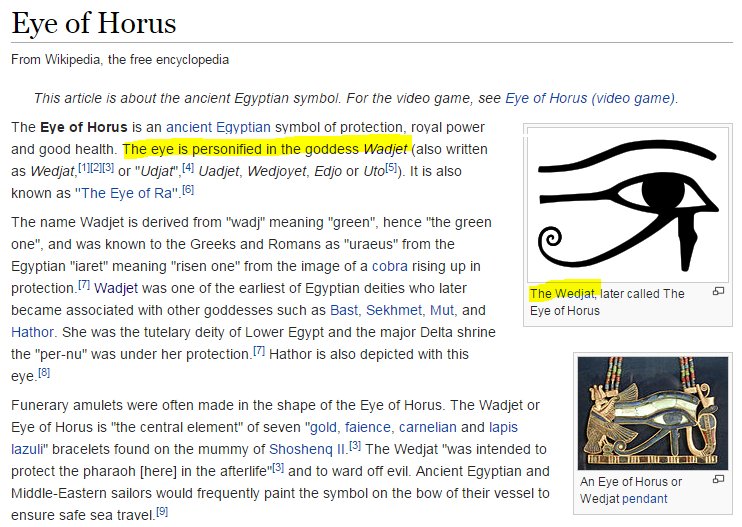
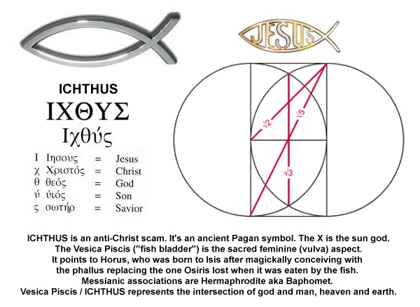
The form of the stylized W conceals what you may now recognize as the fish symbol, the ICHTHUS. This fish represents the fish that ate the phallus of Osiris, and implies that very phallus of Osiris. In the butts, of the W ideogram's hips and the heart ideogram's butt. Sodomite ritual. The Illumination produced through that foul practice is signified by the color white. It had formerly been my custom to document this regularly, and lately, not so much, yet the combination of the white and red does signify the red-daughters of men made white-divine.

We've already considered the evidence for the Walgreen's brand's exaltation of the goddess under many guises and with many symbols.The iconic Walgreens W is for Witch, and Whore, and the stylized form pictures the divine feminine and the bent arm pose of the bee goddess queen of heaven, and the magickal phallus of Osiris. The Eye of Horus has also been documented as present in the branding. The W is for Wedjat, to be sure! How familiar are you with Walgreens, or with any other pharmacy, for that matter? If you haven't seen the sign of the Rx as you approached the store or strolled through the aisles you have been living as one who walks in their sleep, deep in slumber. Rx is the ideogram for the eye of Horus, as modeled on the Peregrine falcon form he takes. You see it on the labels of prescription drugs and on over-the-counter meds as well. The sign of Rx is the eye of Horus. Rx = Wedjat. The W is for Wedjat.

In this peculiar and very special season, recognizing and acknowledging these things in our familiar world still does matter, as does our character development. May the Lord Y'shua's favor be upon you. I pray that you will truly seek Him and His good pleasure above all else in this world. He is worthy!

Thursday, February 11, 2016

In the Spirit of Valentine's Day... Arby's

Behold, I send you out as sheep in the midst of wolves; so be shrewd as serpents and innocent as doves. ~ Matthew 10:16

Because of the nature of this material I'll offer a caveat. If you're easily offended by descriptions of imagery that is fundamentally graphic, you're probably not going to want to see what's on exhibit here.

Do you sense the innuendo in these offers?

Maybe you haven't identified what Arby's iconic Western hat logo really represents. Take a close look and see what you're looking at.

Meat is slang for the penis.


The # symbol has recently become known as a hashtag, but it's been a number sign and a pound sign for a long time. "pound meat" is slang for masterbation. #meatcraft = pound meat craft or the craft of masturbation.

A hat in Occult symbolism is a butt, probably because a hat covers the head-as-glans penis. The Arby's logo is both a hat and a glans penis, the combo being a picture of sodomy. Like the competitor, Jack in the Box. Sex Magick.

Here's a sign.


Not unlike the redbox promotion, where the common vernacular for ejaculation is also used.


The letter "b" in the position and context of the Arby's logo may be seen as an ideogram of the phallic package. If the letter y is taken as a bent Tau cross, the cross on the edge of a circle appears, the XO of the MOB symbol is generated, the union of which establishes the celestial throne of Isis. The color red is her color. This scheme identifies the phallus as that of Osiris, or the substitute that was magically created and used by Isis to bring forth Horus. Sure, it's subtle, but that's how it works, over and over and over again - until this age is brought to a conclusion.

This pricing on this special deal (expired, sorry. ;) ) just isn't subtle, not at all. That's not the kind of deal you want. The numbering that suggests the mark of the beast is not a good deal at all. Supporting that, the dollar sign can be seen as a cross circle sigil.

Suppose the people responsible for that promotion didn't know what they were doing. The result is not very different, from one perspective. Any accounting made by the Lord for the deeds of those involved, whether mercy will be applied or some penalty will be paid, that's something the Lord who is the judge of all will address in due time, with perfect justice. Do you trust him? If you know him well enough, you do. We all need mercy. I pray that we find it while it may yet be found.