
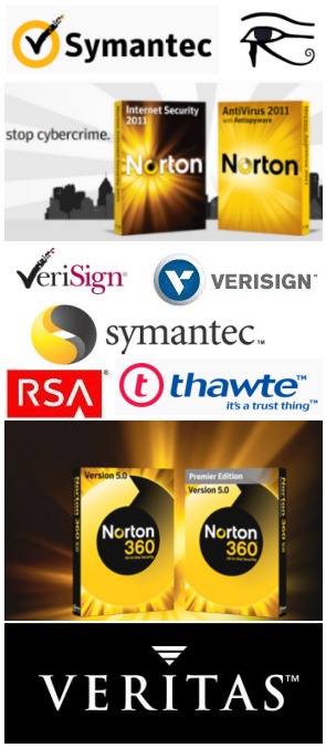
 Symantec is another high tech company that boasts an Eye of Horus brand. The Norton sub-brand certainly projects it proudly with their powerful yet simple swirl eyes being accented by radiant sunburst effects. If you visit their site you'll even see the rising sun dynamic in their animation.
 The Symantec logo had been the 3D eye comprised of a yellow and black yin yang 69 you see in the collage. They acquired the VeriSign company's security business last year and it might have been around that time when they updated to their current design.
The checkmark checking the circle is a combination that, for those of us accustomed to filling out forms on the Web, creates cognitive dissonance.
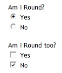 It's not what we expect to see because checkmarks fill square checkboxes and not round radio buttons, as you see in this example on the left. This dynamic effect gives the symbol more powerful influence.
The round-square swap should be familiar by now as a technique that presents us with the Baphomet/Hermaphrodite identities. This is done in every instance of gender bender-blender substitution of the female (round) for the expected square (male) element, or vice versa.
While their former logo is pretty obviously an eye of Horus, it's not as fresh as it once was because the formerly rather slick graphic is less fashionable. The current one picks up a feature from the Verisign logo, the checkmark, and kind of merges it with the legacy eye retaining the orange color and circular shape. The new logo still resembles an eye with its sun colored ring.
In this logo we find see two female symbols, the circle and the V, a downward pointing delta.
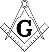 The checkmark also looks like the square of the Masonic square and compass, an association strengthened by the close proximity of the letter S, which is now capitalized. This is like the Second Life logo where the title's
  L as a square is suggested by the close proximity of the S.
 The new Symantec logo now has the look of an owl face, alluding to the Watchers who fell and ultimately became accountable for the flood of Noah's day. They are related to Horus as his close brethren.
The way the checkmark is solid inside the circle and particulate outside, it speaks to me of sexual reproduction, picturing an egg at the time of conception. The sperm outside tries to penetrate the ovum. One sperm has penetrated - V for Victorious! Conception!
VeriSign changed their logo, probably transferring rights to their previous brand imagery to Symantec in last year's sale. Their image resembles the Symantec logo, with a V inside a circle. Theirs leverages the downward delta to great effect! VeriSign had acquired Thawte in 1999, which had a t-cross resembling a nose and left eye in profile inside their circle eye. Horus.
VeriSign grew out of Digital Certificates International, spun off from RSA in 1995. RSA's logo features a stylized A that features Horus as the pyramid with separate capstone, very slightly obfuscated. The R, stylized slightly, probably intends to signal the Eye of Horus as with the pharma Rx.
Verisign's new version is three downward deltas inside the circle. It is a large delta with two smaller deltas removed from it, the negative space created by one of them making the larger delta recognizable as a V. This clever design signals 666, the most familiar Beast number. In Hebrew, the letter we associate with the English V has a value of 6. With three down deltas, or, letters V, it equates to VVV or 666. The triplet should also be acknowledged as presenting the important signaling of the regenerative triple helix DNA transformation.
Observe how the new Symantec logo has its white space divided as into three sections, making it a triskele. Same deal. Triple helix DNA transformation. Mark of the Beast. Eye of Horus.
The Veritas company was acquired by Symantec in 2005. Their logo was an "i" of Horus, the i dotted with an inverted capstone in three parts. Horus? Veritas. Truth.
No comments:
Post a Comment