
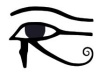
 After a short pause in this long-running series we pick up where we left off, with examples of "i" (or, obfuscated eye) of Horus imagery that saturates our environment with silent yet powerfully effectual spell casting symbols.
 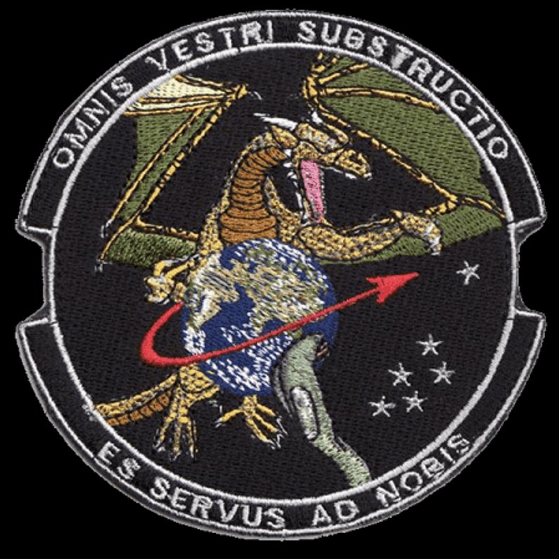 You may have noticed in the blog posted a couple days ago there was some content fit for this series, the featured patch's dragon with a phallic arrow ejaculating a star-seed. You may have noticed how that star would have fit the arrangement of the other five as a capstone of the pyramid as viewed from the earth.
  Consider this a warm up as I introduce a new phallic Horus Eye class.
Certain letter combinations are leveraged in titles to graphically represent the male genitalia. While some examples seem rather innocent, with potential ignorance involved or folks having fun trying to see what they can get away with, what's underlying most of this is actually occult symbolism that sometimes even involves ritual sex magick. This class of symbols purposefully and significantly advances the mark of the beast agenda, honoring and inviting the arrival of the Beast of Revelation 13, aka Apollo or Horus!
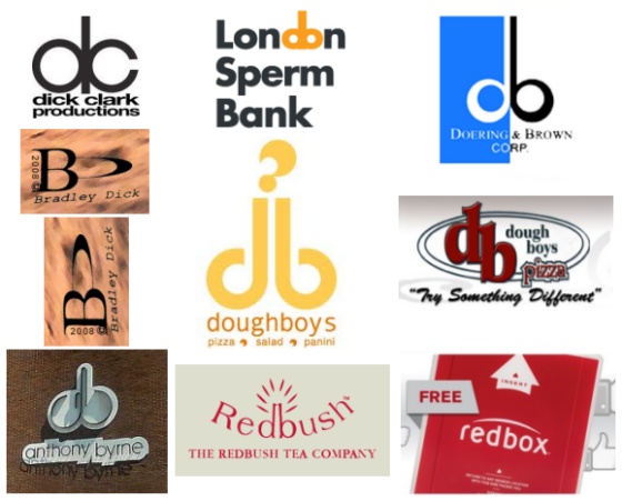 Top center in the collage, the London Sperm Bank combines the letters d and o to picture an erect male member with testicles, which, given that it's a sperm bank, is a bold but fitting identification. The imagery suggests how deposits to the bank are made. By making the d and o "package" flesh colored in contrast to the black used for the other letters, the intended meaning is made all the more obvious. The leveraging of this imagery must be seen as the most legit example there can be, comparing to how the arrow as phallus appears with obvious intent in the male gender symbol-like Kegel Male Trainer logo.
In the center, another flesh colored package is formed with the letters d and b, for a "doughboys" pizzeria This version's "question mark" looking element on top doesn't seem very questionable when considering what it represents, because it can hardly appear as anything other than semen being ejaculated!
At upper left, the letters d and c of "dick clark productions" are a close match to the sperm bank's pairing. Underneath that one, the stylized B and D for "Bradley Dick" might not make sense until you take the cue from the sideways 2008 copyright and rotate the image. I've followed their leading in the image under it, rotating it so the copyright date is right-side up - and the phallic package appears upright! So, there it is. It may be said, howbeit crudely, that the branding for Dick Clark Productions and Bradley Dick appears appropriately enough as a couple of dicks.
Bottom left, the logo for "anthony byrne" with its a and b combining to form the male genitalia might be just an unfortunate mishap, but probably not. The Doering & Brown Corp. d and b combo package (upper right in the collage) may seem innocent, but after I explain a little more I think you'll agree that it just can't be so.
The image underneath that blue, white and black logo is another dough-boys pizzeria brand that compares to the doughboys image in the center. In their busy version, it seems they attempted to obfuscate the package by making the b lower than the d, but I note that placing them inside what is recognized as a pizza pan does present us with an eye. About the phallic eye, sufficient evidence has been presented in this series to assure us that this composite symbol is neither random nor innocent. More on this one in a bit. In the center of the bottom row you see a d and b package being leveraged by The Redbush Tea Company. When you recognize the male genitalia and consider the brand's graphic it becomes shockingly apparent that the bush of Redbush is a slang reference to a woman's pubic hair! The Redbush imagery is equivalent to the red heart and arrow of Valentines Day imagery. The positioning of the elements in their branding graphic leaves little of sexual intercourse to the imagination and leaves me wondering just how blind we must be not to see what's right before our eyes! What a powerful spell of deception is cast that cloaks such as this! This company is actually a legitimate commercial enterprise that has marketed a tea known as redbush, or, Rooibos (Afrikaans) since 1997.
The final image in the collage (bottom right) is the redbox brand, one many of you have discovered is now appearing in your local shopping center identifying an automated DVD and game rental kiosk. What you see here is a picture of their logo as it appears on their DVD rental product packaging. This features a large white arrow (phallus symbol) to show how to insert the package into the receiver on their kiosk, plus a male "package" of the symbolic d and b letter combo kind! Just like how the Redbush Tea refers to a woman's privates (bush), redbox (box) does the same. Redbush, redbox; same d and b male genitalia, similar slang references to the female counterpart, same Valentine color and meaning!
While the Redbush pubic hair is pretty obvious, the redbox version is much less so, possibly requiring some familiarity with the associated signal elements to help you confidently identify what you're looking at. I'm going to elaborate on the redbox logo and revisit some of the other images in the collage to present how that beyond simply presenting the male genitalia many of these signal the eye of Horus. Notice how the white arch above the word "redbox" spans from the r to the x. Connect the two as directed and you have rx, which is Rx, the symbol that has long been associated with prescription drugs and preparations used for healing and casting spells. The symbol is well documented as a version of the Eye of Horus. The white arch is in this context the arch of the eye or eyebrow. When the redbox title logo appears with the registered trademark image, the little Eye of Horus is the darkened left eye that signals Harmerty, Horus "who rules with two eyes."
 The white arch presented over the title on the red background can also be seen as the rising sun, a classic Horus image picturing the dawn of the returning sun god.
With regard to the sexual imagery, the arch represents the line of the female during sexual intercourse as when the male penetrates so deeply as to hide nearly all his shaft. This view is supported by the very short stems on the d and b letters and then further by how the packaging design hides the shaft until the big white arrow head appears right in line where it should be. When you insert the package as directed into the kiosk's receptacle, you are engaging in a sex magick ritual. Yes. Really.
Each of the instances in this class of phallic letter combos can be considered as eyes of Horus in that the testicles are "eye balls." In this context, the odd question mark of the central doughboys appears as a third eye, the drop of semen being a bindi, which, translated, means, drop. Some subtly present Harmerty, like Doering & Brown, Dick Clark Productions and dough boys pizza. Doering & Brown presents the left eye as darkened because the b is black opposite the white and blue eye illuminated with the divine light of heaven. The Dick Clark Productions logo presents Harmerty in how the left eye appears to be broken. The left eye (on our right) of the dough boys pizza pair is set below the other, lower in rank and therefore the ability to see, thus darkened.
Are you seeing what you're looking at? Praise the Lord, who opens the eyes and shows us what we need to see to be set free from the snare that has been set before the stupified worldly. Soon, those who stumble in darkness will find themselves ensnared because they refused to love the Truth, and their fate will have been sealed!
Wow the RX is something I never thought of before and I study these things - great enlightenment! RX also = pharmakei (sp)
ReplyDeleteThe phallus stuff is out of hand. Surprising that so few notice it. I have noticed it on the very small bags of Lay's potato chips as well - check it out some time. (sliced potatos = phallus.)