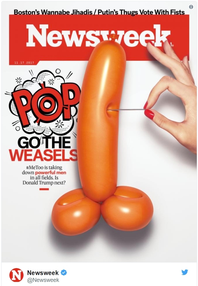
 The 11/17/2017 cover of NewsWeek was incendiary. Pundits have reacted with their takes on this spin off the traditional political cartoon. Our take is a little different. We have no political "dog in the hunt." We note that the image addresses a single narrow view of the matter of sexual exploitation and intimidation tactics. There is some shock value in the promotion of this anatomical imagery. “Any publicity is good publicity,” it has been said, and that seems to have been NewsWeek's assessment as they signed off on this design.
We don't scour the dark corners of gay porn to find our material. We don't need to or care to. Our interest is in exposing what's influencing the innocent as families carry on with their daily lives. This Newsweek cover wasn't wrapped in brown paper or hidden behind the news stand counter.
As we explore what the pundits ignore, and offer some commentary on the more superficial, we'll focus primarily on more powerful influences and deeper agendas.
In the stylized word, POP, the letters P P in the context of the male package signals pee pee, for urine, and peepee is also how toddlers refer to the penis.
I'm going to present a word, and I want you to reflect on what comes to mind as you consider the cover. Prick.
What was the first thing that came to mind, and then the second? See, there's more going on here than what appears at first glance. Was it the action with the pin and the balloon that lingers in your mind, or the male member itself? Do you think this cover might have been designed with the word in mind? It's called a homograph when words are spelled the same, but they have different meanings. To present two meanings of the word, prick, in this way is to employ a mind-control technique. It works whether you identify the word at the fulcrum or not. The power level of the magical working is enhanced by the tension or stress created by the suspenseful visual. Just how much more of a prick can the prick take before it goes pop?
There are several layers of identification in play, as to just whose is the male package. “Pop go the weasels.” Most immediately, it's the weasel weiners Weinstein and Weiner and the likes of Bill Cosby and Kevin Spacey and Bill Clinton and so on, whose names have been appearing in recent news. The main identity of the male package is the POTUS, as the question is asked in the copy, “Is Donald Trump next?” With the balloon about to be popped, the language used and what appears to be the premise of the article makes that plain. This leveraging of the homograph, prick, has to be seen as a subliminal labeling of Trump as a prick, as a cowardly and vulgar swipe at his character.Another identity is implied in the way of Occult subliminals. It's that of the Most High God, who is continually derided by the Luciferian illumined as the Author of patriarchy itself. Embedded in the expression, GO THE WEASELS is a cross-line reading of HE and EL, which speaks to me as a reference to the Most High God.
As a single word, HEEL, another derogatory term appears in connection with the male package. Two meanings of the word are Oppression; tyranny, and: A dishonorable or unscrupulous person. Does that fit the context? Perfectly! This is a form of NLP: Neuro-Linguistic Programming.
The expression Pop Goes the Weasel is anchored in my mind to the child's toy called the Jack in the Box. Turn the crank and the tune plays. When you get to the “pop” lyric, the lid opens and out pops the joker-clown called Jack. The woman on the NewsWeek cover who is pricking with the pin is thus linked to the turning of the crank. Crank is slang for penis. See it?
It's another subtle denigration of Trump and every virile male. By deflating the balloon she's going to be able to stuff the manhood, or manhood itself, back in the box. Emasculation. Ready for another refrain. "Around and round the mulberry bush the monkey chased the weasel..." More than a mere deflation, popping a balloon means destruction. A popped balloon can never inflate again.

If the NewsWeek cover design and article agreed and the subject was covered with journalistic integrity and motivated by real compassion for the victims, no one innocent would be victimized. The victims of sexual abuse in Hollywood and Washington DC and everywhere else are both male and female in gender, and so are the abusers. Yet, what is behind all their superficiality is far more evil and deeply hidden.
From Wikipedia: “A theory as to the origin of the jack-in-the-box is that it comes from the 14th century English prelate Sir John Schorne, who is often pictured holding a boot with a devil in it. According to folklore, he once cast the devil into a boot to protect the village of North Marston in Buckinghamshire. In French, a jack-in-the-box is called a "diable en boîte" (literally "boxed devil").”
Given the history of the expression used, what we're looking at is the Jack, or shall we say the one-eyed Jack, which is slang for the penis. This one-eyed jack penis is the devil popping out of the boot. We are dealing with Trump, on one level, and in some card games, the one-eyed jack is trump, a card that is assigned special authority. Think about it. It's no stretch; the connection identifying the penis of the Devil is present, and so is the deviling or demonization of Trump - and it is potent.
This identification is strengthened in the context by the way the final P, in POP, and the last S in, WEASELS, touch the balloon. It suggests that words that begin with those letters are concealed behind the phallus, occulted. Words like Satan's Penis, or, Serpent's Penis.
With the inflated phallic package as the Serpent Penis, the one-eyed devil sprung out of his boot, I believe this is the physical evidence of a spiritual assault or curse. This political cartoon cover is symbol magick, a form of sympathetic magic. It is cast against the POTUS and, even far more significantly, against all men with attributes of male virility and masculinity, who dare to buck the trend and assert their grant of authority as a male.
You may wonder how a symbol can represent opposites like the Most High God and His avowed enemy at the very same time. Look at the Catholic Church. This is how it works in the mystery religion. The true is hijacked as a carrier for the lie. The counterfeit bears the image or form of the genuine.
Let's give the target design that is similar in appearance to a major corporate logo some consideration. The presence of such a symbol plays on the obvious level where women have been targeted as victims by men with the phallic dart or arrow. The #METOO movement is presented as a response to that, where the victims seek justice. Now, those accusers are firing their darts and arrows at the accused as targets.
Strong emotions are provoked by this magazine's cover art. This is more than common journalistic sensationalism. We believe this should be recognized as something that is intended less for sales and profit than it is for the value gained by the worshipers of the phallus, of fertility itself and the false gods being served by it all. This emotion is engaged in the ritual raising of energy, demonic energy by sorcerers. The energy is raised and harnessed and redirected as it is sent into the universe, being cast as spells. If there were not a real threat, the Bible would not deal with witches and the practices of witchcraft. The Bible does deal with it. It is real, and it is a threat.
There's more trickery involved, and if you suspect that the exaltation of the goddess and mind control influences of coprophilia and sodomy might be involved, your suspicions are correct! Which is all awaiting another post, Lord willing.


 Audio Download
 The Story of Christmas That Should be Told
 The girl's hat has the Krispy Kreme branding, and they must be sponsoring the event. We've got a post on their branding.



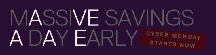
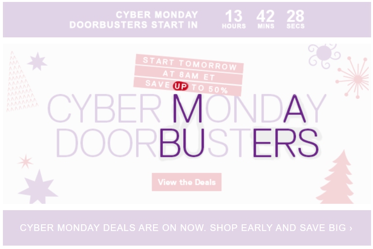
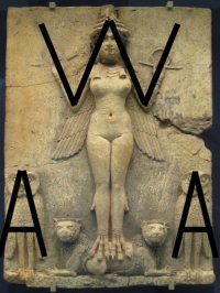 This goddess exaltation has got to be good for sales and marketing because the Occultists accept that it's the goddess who gets you what you want, and that's what they continually project into the mass hive-mind consciousness of the mind-controlled masses. Massive Savings.
 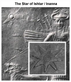 The image in the Dell email was animated, with the big snowflake-like decorations seeming to rotate in an ambiguous manner that could be interpreted as being either clockwise or counter-clockwise in direction. A snowflake has sixfold symmetry yet most of these have eightfold symmetry. Why? It's the celestial heavens, with the twinkling traditionally 8-rayed Star of Inanna, multiplied.

 Toyota - Take Over. This rather unexceptional looking ad seems pretty innocent, yet the many layers of occult symbolism reveal otherwise. It's a goddess takeover!

 (See this post for more examples of this imagery in our popular culture.
  When we perceive the embedding of the horned bull and identify it with Taurus, the sign of the constellation, we discover another reason why the Toyota logo is silver. There is an ancient celestial stargate known as the Silver Gate. This is located from our perpective between the constellations Gemini and Taurus. This is an ancient demonic portal through which entrance is made into this realm. Supporting this, what is recognized as a letter T in the logo is for Toyota, and it is a Tau cross, for TAUrus! In commercials, which you can find on YouTube, this logo has been appearing as kind of magic portal. See the logo as a wheel within a wheel design, as per Ezekiel 1 and 10 and the multidimensional throne vehicle of the Most High God.

 The X and O are the reproductive organs of the divine, so there is sex magic involved with the union of the X and O, and this is a major vibe of the Toyota logo. Because the letter Y is an intersection or CROSSing of 3 lines, the word, TOYOTA, features 4 sets of adjacent cross circle pairings: TO + OY + YO + OT
 The horned cow/bull of the logo presents the image of the female reproductive system, and the image of the male appears in the same location, overlaid. It's the T or X as male phallus and may be seen as the phallus with pubic hair, or as the entire male package, inverted.
 Another Occult layer is added by the encircling of the word, for, which involves more genatria numbering. This is the little design element that the Lord kept calling to my attention as I would return to reflect on the ad. The enclosing circle is a letter O that we can include with the letters of the word inside. Read it as, foro, ofor, foor, or, better yet, roof. Any way you order it, it's Code 54, the love code! This is resonant, magically, with the other themes here! For one, it's resonant with the red featured in Valentine's Day's hearts and roses - Cupid - Eros - Venus, the Goddess of Love.
  Here's a couple of bonus observations about some popular red roof brands. Red Roof Inn. Love Code 54. Goddess of love/Cupid/Eros red. Is this the vibe for an attractive love nest, for an intimate sexual liason?
  (Seen our video series on the subject recently?) Pizza ~ Piece of... hat-butt. Sodomite love.
 The direction given to the viewers of the ad is to, ROLL OVER FOR ANOTHER OFFER, which suggests the offering of another orifice for sexual intercourse.
  Quick Start Intro