
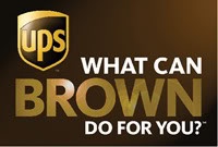
 UPS - United Parcel Service - The Big Brown Machine. London Olympics Official Supporters. Almost a decade ago, they updated their brand, modernizing the logo and introducing their slogan, “What can Brown do for you?” That seems like a wonderful service oriented marketing approach - until you realize that sodomy is the theme being promoted on the sly. When you discover their secret, that the color is referencing the dirty deed, you won't want anything Brown wants to do for you. I'm not suggesting that anyone should ban the company. I am bringing the brand's secret into the light of day so you can see what you're looking at. A subtle spell of deception has been cast right in our midst, undetected in the realm of our awareness.
I had this brand in the queue for the "i" of Horus series for a while, in the line up of phallic Horus Eye symbols composed of letters and letter combinations. The letter “p” is for penis, pictured anatomically correctly flanked by the “u” and “s” as testicles. The “p” is for Phallic Package. This interpretation is more obvious from their earlier logo, a Paul Rand classic that endured from 1961 until 2003 when it was replaced with the current, more subtle, version.
Again, caveat, if you haven't read the earlier posts yet, I strongly recommend doing so before you continue. Also, be forewarned: What you see here you probably won't be able to un-see.
 This version presents us with more context within which the orientation that's only hinted at in their new logo can be identified. This is the backside of a male, as presented for sodomy. The port of entry - X marks the spot. That space between the two featured areas is the perineum. There's the context of the male genital package pictured by the letters “ups.” The shape of the shield is that of the glans penis. There it is. Shall I apologize for the unpleasantry? I did warn you. You really need to see what you're looking at. The influence of the sodomite gateway is a constant reality in your familiar world.
 I'm old enough but not yet too old to remember how Parcel Post packaging used to be characterized by lots of brown kraft paper and twine. The knot in the twine you see compares to the Master Mason emblem of “Two-Ball-Cane” and the sphincter, from Part 9, right?
 Recognizing the registered trademark symbol as a darkened Horus Eye signaling Harmerty, we look for the requisite opposing all seeing eye and find it in the sun yellow rays appearing as spokes of a sun wheel. Yet, this feature is even as the dark light of a brown sun, the puckered eye featured so prominently in the imagery of Freemasonry. This is where we see Paul Rand's version squaring the circle, in alchemical metaphor. Instead of a circular anal eye, the form has been squared, presented to us as a rectangular rectum.
The loops of twine are as eyes, and at the intersection is the third eye. To untie this knot and open the package is as the opening of the third eye through sodomy. I want to point out a really important element here that you'll want to keep in mind. Two keys are pictured in those crossing loops of the knotted twine. The crossed keys of secrecy represent a blood oath, made between those who so engage, to forever conceal the sodomite secret. Those who engage are bound by it like this knot is binding.
This is very serious business.
So, the logo features a package. They are in the package delivery business. Are they mail or male packages? Hmmmmm. When they come knocking at the back door, is that going to seem a little awkward?
 Try not to laugh when you see them pulling around to the rear entrance to make a delivery, or pulling around front to get your package.
 In this collection of images the common theme is pretty obvious. Yes, I'm afraid that Patriot does indeed have has his third eye opened, that sodomy portal. *insert applicable golf club locker room joke here* So, FRINGE DIVISION? Really? That's just not right.
So, what can BROWN do for you? What do they want to do? In this promo image, consider how the expression sandwiches “OWN.”
Think about it. They suggest the answer they are looking for with some NLP action with a graphic assist. They want to OWN you. How is that? Well, in the context of the other esoteric signaling you have to consider sodomy. Recall what I wrote in the previous post about wanting to own the “horn of plenty”? The owner gets whatever they want. The owner gets brown. Brown owns you. As a gauge of influence, how popular is this brand of shipper? They are much bigger and more widely recognized than the sodomite brand Taco Bell (think outside the bun) that was featured earlier in Part 6. UPS is top ranked in their field, with FedEx not far behind. UPS delivers more than 15 million packages a day to 6.1 million customers in more than 220 countries and territories around the world. If you're not noticing them as they do their business it's because they are just that familiar.
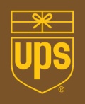
The updated version of the UPS logo is much more subtle, substituting a lingering suggestion for the picture that leaves far less to the imagination. For it's subtlety it wields the more powerful influence. Like many other rebrands trending as more simple and elegant, like Aetna's for example, this is magickal working fit for this season, now able to be built upon the substantial foundation established through the preceding generations.
 The dynamic of the swirl is introduced, inviting us to rotate it, to flip it over. The line of the dynamic passes through what those familiar with the legacy image would associate with the uh, third eye. If we literally flip it, the phallic package appears in the more familiar orientation like we see in the London Sperm Bank logo. We can also take the suggestion as, “Bottoms-up” right? That's the presentation for sodomy illustrated so graphically by the former logo.
 UPS ~ UPSide down
UPS ~ U=You P=Pee Standing? Look out!
The updated logo squares the circle in rounding the top and connecting it to the flat sided shield, like the Masonic Royal Arse, uh, there I go again - Arch. That's pretty subtle, so it's strengthened by another subtle instance of squaring the circle created by a slightly modified letter “u.”
As with Paul Rand's iconic branding, this new one must also feature the all seeing eye that's required to balance the registered trademark. In occult imagery like Levi's Baphomet and the Masonic Temple tracing boards, the sun always appears at our upper left. This is very subtle, but the reflective highlight implies that bright sun eye balancing the dark moon of the registered trademark. That's where the golden yellow is concentrated. This Eye of Horus is the same Brown Eye of the Square and Compass G - the illuminist sodomite gateway.
Yet another subtle feature working its magick below the threshold of our awareness is evident when you recognize the new shield as an acorn. The oak is a symbol of the Serpent tree, of Zeus, and Odin. This symbol is one I came to understand during the season I was blogging about The Iron Giant, because Hogarth's occult signaling house was decorated in an oak leaf and acorn motif. Quoting from Part 4 of that series: “The acorn, as the seed of the oak, signals the offspring; Thor, of Odin, and Apollo, of Zeus.
The acorn identity is the Beast and those who are likewise transformed by his mark.” By the way, the shield is another symbol that has long been associated with Zeus. The slogan that attended the new logo's launch has been replaced with another, one that includes another symbol to make the slogan more of an ideogram. It translates to, "We Love Logistics." Oh, it's still a sodomy signal, but enhanced!
 Since you're probably reading this on Valentine's Day, let's first take a look at that season appropriate imagery, the heart and the arrow. From this illustration no further commentary should be necessary. The UPS love symbol is not the arrow piercing the heart. The arrow is going around the heart, not in it.
 Why go around? Where is it going? Let's break it down.
logistics = log + i + stics = “Log, I sticks” or even “log eye - sticks”
Check out slang definitions #1, #4 for “log” here in the Urban Slang Dictionary It's an equation that adds up to SODOMY!
We “love” (as in “making love,” sexual intercourse) log I sticks
Funny? Not really. UPS. Nasty buggers.
Here's a few more observations. When you consider the picture made by the letters “ups,” the p can be considered a side view of the phallic package. It then belongs to the "s" as the Serpent Satan's, pointed at "u" - you. When the logo is flipped, as suggested by the dynamic, the ups becomes sdn. It looks like “son” - the acorn - Horus.I find it difficult to imagine that it might be a matter of coincidence that UPS is headquartered in Sandy Springs, Georgia. If sand is dirt and wet dirt is mud, which it is, or course, and this is fecal imagery, then what is Sandy Springs, really?
 It calls to mind a local amusement park, which I addressed in the "i" of Horus series for its phallic letter combo, dC. I'm really not amused. You did notice the big round filled circle perched right over the “as,” right? Sand Castle my - eye.
 Their parent company has the inverted red star (angel) shooting though the p-hole. So that's entertainment at the Palace? I'm thinking that's not really an improvement. Given the way her blue legs are bent, I'd say someone is looking forward to Horus being born into the world, fast!
At least we don't have to look at that every day.
So, what can Brown do for you?
I'm interested to know - if you have any info on Paul Rand, or what are your thoughts on him?
ReplyDeleteI haven't researched him much. The physical evidence is an obvious witness that he was responsible for many major brands bringing major evil through occult symbols into our world. In this way, he changed the world.
ReplyDeletePaul Rand is Graphic Designer.I've got a seminar in 10 weeks. we've had to pick a graphic designer and I've chosen Paul Rand because he's my favorite!
ReplyDeleteNLP Training
This is really very deep. Will companies go this far to promote? I am building a site for a UPS store. In my search for UPS I found your site. I got something good out of it. http://tinyurl.com/mobi-web-3-0
ReplyDelete