
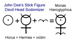
 In the introductory post of this series, John Dee's Monas Hieroglyphica (1564) was exposed as stick figure drawing illustrating sodomy, with Horus and Hermes identified as the sodomizers. While this esoteric standard isn't one you'll see every day, it's certainly the foundation for some of it. Many of these images are of the Horus Eye class, or of a class I've been featuring as the "i" of Horus, where letter sounds are used as homonyms, or letters are pictographs (pictograms). These are ideograms, symbols that represent ideas. The idea conveyed in most of this collection is sodomy, with a few related images tossed into the mix as visual aids.
Like I stated in the intro post, because of the nature of the subject there's no real delicate way to address it. To recognize the magickal symbol snares set for you by gutter-minded people there's a sense in which you must change your perspective, lowering your viewpoint to see these things from their angle. Sodomy isn't being projected to simply amuse or offend people because most don't even perceive it. It's being projected to ensnare people in the web of deception with Mystery Babylon's pharmakeia, captivating them. It works. Some of you need to see this and be set free from it. Whether or not sodomy is personally practiced or even a temptation is not really the issue here. It's the full spectrum and every bandwidth of demonic projection through symbols that captivate that is the issue! What this all really means is dark and utterly tragic, but retaining a light heart helps us cope with the discomforts of learning to recognize and interpret these symbols.
Here is the evidence of sodomic magick at work in our culture. I'll start out with a few examples that probably aren't familiar but are so blatant they have to be seen as comically unfortunate for those organizations who chose these images for their brand identity.
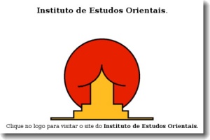 These are all legitimate logos.
The first is for Instituto de Estudos Orientais. It's a golden temple framed by the rising sun. Well, if you try hard, you might see that. Their organization and facility might not actually be devoted to the worship of the sun god through the practice of sodomy, but given the logo and how common that appears to be, it probably is.
 The Kudawara Pharmacy logo is puzzling. If not sodomy, what could they have had in mind by dotting the K with heads? Since their business is pharmaceuticals, it must be said that connecting pharmakeia and sodomy does make a well matched pairing. Do you think any of their cashiers ever wondered why it seemed like every other customer was stocking up on condoms?
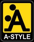 The A-Style logo has an interesting history. It was first a fad logo without an actual company or product behind it. Now, it's a major company that sponsors events like MotoGP. A-Style. Think, doggy style. I wonder if they have a bobblehead version. This logo is a little ambiguous. I don't mean as to whether sexual intercourse is pictured, but as to which orifice is being used. One might insist that it's A for anal, but I suppose that's left to our imagination. What shouldn't be ambiguous to you and I is that the A in the sun yellow A-Style logo is really for the sun god Apollo. This is Apollo-Style. It's an "i" of Horus pyramid capstone symbol. This graphic must be taken less as a “one orifice or the other,” symbol than one meaning “every available orifice.” That's the Apollo style.
  Square is a hot mCommerce tech company, moving us off cash to trust and depend more fully in bankers and merchants to keep our digital accounts. This is an integral part of the Beast and mark of the Beast plot. Their logo is the simple dot in circle Horus Eye - with a twist. A dot in circle means male inside female, sexual intercourse. A dot inside a square is, well, think about it. The rounded square is the effeminate male. Male inside male - sodomy. Visa, a Hermes brand is a partner with ownership stakes in Square. These folk get John Dee's glyph. Horus. Hermes. Sodomy. Check, check and check.
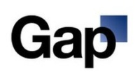 Folks who saw Gap's (clothing) attempt to rebrand in October 2010 clearly didn't "get" or appreciate the symbolic sex magick “upgrade,” squawking so loudly about the change that, literally within the week, the company stepped back into its former identity. The square is the symbolic male and the light gradient shows clearly where the action is taking place, right in the "p" hole. p = pee. What kind of gap are they talking about, here? Something anatomical? At least they weren't served up a sodomite version.
  The "p" hole is identified as a Horus Eye by the symmetry implying a four quadrant sun symbol. Balancing that, the stylized G is a giant ouroboros phallic arrow.
While we're on the subject of gap clothing, here's a sad commentary on the abuse of the second commandment. I'm quite sure that picture is NOT what Ezekiel's God had in mind when He gave him to write that verse. Blue divine Apollo stands in the red Adam gap. Oh my, that's a big obelisk. I bet that hurt. I'm guessing the vendors were sold out of the matching trousers. The graphic artists even made a cross with the obelisk as the vertical, with the horizontal signaling the daughters of men. Ouch.
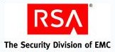 Here's another, more subtle, version of Apollo standing in the gap. The R is stylized to hint at the common Horus Eye and also form a third triangle, signaling with the three a 3x3 or 9, the mark of the Beast transformation number. The little white triangle is the Horus Eye capstone, which, instead of appearing over the body of the A, appears underneath, to stand in the gap, it seems. A is for Adam? For Apollo-Style? RSA is the Security “Division” and, with that word appearing right under the wedge, the dynamic suggests driving the wedge into the gap. These letters R and A flank the S for the sodomizing serpent Satan.
  While not technically a sodomite symbol, when NASA made their insignia public, they didn't have the decency to put any britches on their Horus Eye and fork-tongued serpent brand. That nasty serpent is talking out of his “as.” That's one way to lick at it. Motto. “For the benefit of all.” I just don't see it that way. Was NASA inspired to start shooting their "rockets" at the "moon" because of John Dee's glyph? Did the Nazi science from Project Paperclip draw from the wellspring of Monas Hieroglyphica that Dee claimed would “revolutionize astronomy, alchemy, mathematics, linguistics, mechanics, music, optics, magic, and adeptship”? I think I know what Jack Parsons of JPL would say about that, who had been pleased to follow Aleister Crowley closely, the infamous champion of buggery and all manner of sexual perversion.
Houston, we have a problem.
Christina Skinner commented the following.
ReplyDeleteThis is starting to hit like a ton of bricks. iPad, iPhone. I always wondered why the 'i' wasn't capitalized and thought the whole thing was a more than dumb. There's much greater meaning behind all of these things. Things that are not only used by the populace, but idolized in their own right! How many people are hard core Apple customers and will wait in line for days and pay far too much money for an inferior device! They are under a spell of sorts.
Yes! Also Here's A Secret; NASA's Snake tongue which it likely IS NOT (unless it's A Snake tongue i.e. Brotherhood of the Serpent bloodline shout out) Because It's A Vector symbol. Which is used not only on damn near every Moon mission Patch (logo) but it's also deeply Masonic! Because *the Vector* is UNNECESSARILY FOUND ACROSS A BROAD SPECTRUM of Logo's & corporate insignia's OF SIGIL MAGIC! Now keep in mind there exists some very real, very old- NASA UFO Footage of A strange green Vector like Exotic Craft. Caught on satellite film orbiting the planet. Recorded many Moons ago. Now is that the 'nudge, nudge' / 'wink, wink' {Insiders group} WE KNOW ALIENS/ DEMONS ARE REAL CLUB SYMBOL.. Is that whats the Vector is all about. Or is it something even more, much more ??
ReplyDeleteIm still searching...
So the lowercase i is the silhouette of a person, what’s the significance of the P?
ReplyDelete