
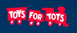
 Toys For Tots is a popular children's charity that gets a lot of publicity during this season. Their subtle logo introduces a new symbol for this series, the train, one the Lord began to highlight for me as I explored another website.
 Update: 12/7/12: I've removed from this post the references to that site and imagery as a consideration for the proprietor of that site, at the Lord's direction.
 Caveat: This post is suitable for mature readers who are not offended by graphic descriptions.
 The train of the Toys For Tots logo may be identified as a picture of a sodomite orgy. Each car of the train represents a sodomite. When two sodomites engage while on their feet and others participate in the orgy at the same time, those engaging inthe act link together as cars in a train. This is a male train, not a mail train, right? Da Vinci's Vitruvian Man is like an abbreviated male train with only 2 cars, where the Toys For Tots logo pictures a 3 car train.
Validation is provided through some additional signaling. In railroad terminology, you could say the backside is a caboose, and this is graphically illustrated in the Toys For Tots logo. Each word has a letter “O” inside. Each car has two wheels with stars. In this view, the letter “O” represents the anal orifice, and the star(angel)-wheels, testicles. It's a male train, a bloody red sodomite orgy. The engine is signaling an instance of Harmerty with star-wheel eyes. Between the engine and coal car we see rounded and squared elements in opposition, signaling the squared circle. 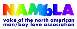 The male train may be concealed and revealed in logos by means of having elements that represent the partners connect in some way, sometimes by simply touching like the letters “M” and “b” of the “NAMBLA” wordmark. Capital “M” for “man.” Lower case “b” for “boy.” Touching, and isolated from the other letters to further call it out. NAMBLA is of course the North American Man-Boy Love Association.
 Extending this kind of signaling where a male train or some pedophile relationship is pictured in esoteric symbolism, the letters CL presented as touching or graphically associated together may signal ChildLove, and likewise, GL and BL may signal GirlLove or BoyLove, and such as WG (W=Woman) or WGL or MG or MGL may do the same, where other validating signal elements appear in the context.
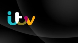 Another brand that illustrates the same activity as the Toys for Tots logo is a BBC competitor, the ITV network. They recently introduced a new logo that is being met with some controversy. The Mirror reported that, “ITV's new logo has been ridiculed on Twitter with some suggesting it looks like a bottom or even an Ann Summers sex toy.” ('It's like a complicated sex toy': New ITV logo ridiculed on Twitter and the best embarrassing logos ever) The stylized letters “i” and “t” are being recognized as a bottom, and I believe this was intended but not on such a conscious level. It is also being identified as a sex toy. There's more to it than that, but those folks who see it and think bottoms and kinky sex are very perceptive.
 What the ITV logo represents with its overlapping connected letters is a male train. It most closely resembles a version of the Toys for Tots logo that interprets their Harmerty-signaling engine as a face. This sodomite orgy features the one in the middle being sodomized and at the same time receiving oral sex. Seeing the rounded “i” and “t” as a w-style “bum” pretty effectively illustrates where the focus is placed.
I see the letter “v” as the ubiquitous Masonic square, and instead of a compass to provide the sodomy signalling circling of the square we have the rounding of the “i” and “t,” which also forms the buttocks.
What the stylized letters “i” and “t” also provide is a numeric symbol. A “w” is a double “u” or “v,” the Hebrew letter “vav.” w=66 With the final “v,” that's an instance of 666!
 If you invert the logo, the “it=w” becomes an “m,” for Mason, Monas and a 13 signaling the rebel lord Beast. The v-square then becomes the acute angled Masonic compass. As the “m” is a 13, the “w” is a 23 signal, the chromosome number.
 From the Mirror article linked above, you'll also read a statement from ITV Group Director of Marketing and Research, Rufus Radcliffe. “We are really excited to soon be unveiling a new identity that is as up-to-date, and relevant as our content. Big, bold and creatively ambitious, it will be true to our DNA as a brand at the heart of popular culture.” Given that the 666 pertains to the Beast and his mark and that a DNA transformation is implicit, I have to agree that this symbolic logo does indeed place the ITV brand at the heart of popular culture. With a nod and a wink, that heart is also the I “heart” cornhole heart. The worldly rush headlong toward sin and death.
The logo for the Bureau of Health Promotion, Department of Health, R.O.C (Taiwan) is yet one more male train, representing an official collection of government agencies that includes a Child and Adolescent Health Division. Sad.
Misc. Related Links:

- Freemasonry's Best Kept Secret: Ritual Sodomy
- First Graders Face Sodomy Charges
 Child Porn Epidemic in Defense, Intelligence, other Agencies
- Voice of Elmo Kevin Clash quits 'Sesame Street' as second man makes underage sex claims
- Mia Farrow's brother charged with child sex abuse in Maryland
- Sodomy and the Pirate Tradition: English Sea Rovers in the Seventeenth-Century Caribbean - By B. R. Burg
- Hell Minus One - Anne A Johnson Davis
- Cisco Wheeler, Interviewed
https://www.youtube.com/watch?v=mcsYNTJb-1w
ReplyDeleteThis commercial promotes ritual sodomy of infants.
That's the first I've ever seen for infants.
The company was founded by Jessica Alba.