
The rappers name would have been the first clue that there's probably ritual abuse involved. Here's a video.
The authorities might want to turn their attention to the local market for more signs of ritual abuse, perhaps assigning stakeout teams to the dairy section to see who might be lurking around the yogurt. Seriously, the Yoplait brand is a regular orgy and sodomite love fest.
For yogurt, a dairy product whose appeal lies largely in the benefits offered to the GI tract, it makes good marketing sense to link the product with the GI tract in subtle ways. However, selling probiotic products that promote healthy intestinal flora with imagery of female and male genitalia, the anus, homosexual symbols, sexual intercourse and magick circles strays way beyond that!
The usual caveats apply, so if you're a victim of ritual abuse who is still being delivered or you're easily offended by mature subjects and descriptive language, please move on. If you're new to this series, welcome! You may want to start at the beginning to get the foundation for what's here. Series Links: The Sodomite Gateway
In this first set of images, the extremely feminine “lids to save lives” promotion is a good launching point to highlight the brand's anatomical imagery. The stylized pink ribbon is cut short on one side because if it weren't, the female genitalia would be way too obvious. In this set you see I've tilted the Yoplait logo into a more easily recognized alignment and faded the nonessentials to illustrate that, too, as the female genitalia.
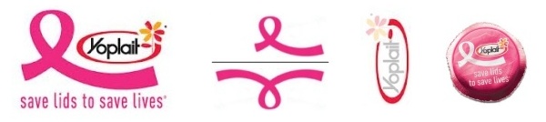
Because of how the two versions of female genitalia are placed together in the promotional imagery, the homosexual engagement of “scissor sisters” is illustrated. When these images are placed on the lid, which has to be removed to get at the product, those behind the branding and packaging involve you, the consumer, in the enactment of sex magick, and you can bet secret rituals have been performed by sponsoring parties to both cover their scheme and harvest this supernaturalism!
The pink ribbon is an international symbol of breast cancer awareness, which is generally recognized as being derived from the red ribbon for AIDS awareness. Yoplait's lids promotion benefits the extremely popular foundation Susan G. Komen for the Cure. Note the date associated with the promotion. “General Mills will donate 10 cents to Susan G. Komen for each lid received and also for each code entered by 6/30/2013.” I believe a 9, 18 and 666 are being signaled.
The numbering of six appears in the Yoplait logo as the number of petals in their flower, the number of man often used in allusion to Revelation 13:16-18.
 Six petals conceal the hexagram used for literally putting the hex on the sorcerer's prey. Those following this series should readily identify this flower as a sodomite sun god anus, with three of the petals being orange. The pink petals associate this portal primarily with the female.
 Did you happen to notice how the stylized pink ribbon is a small segment of a heart? The charitable work of the elite is ever the Love In Action, the coded sodomite phrase of the Lucis Trust that is equated to World Goodwill.
They apparently get it at Pitt.
So, supporting all that we see the sodomite theme repeating in the imagery for another promo called the Million Cup Giveaway. The female backside is featured in both of these ads, covered with the familiar Yoplait packaging. In the upper ad, the Yoplait logo is stamped right across her butt.
Note the rounded square orange element with the divine white anal star flower inside. This is the graphic element assigned the role of presenting the desired action. Responding to their prompt to “LIKE US” is then what I have learned to recognize as a form of sex magick.

Note the appearance of another 6 in the lower ad, in the 60% figure highlighted. The other number highlighted is the 2X. If we interpret that as doubling the six, it cleverly combines with the six petals of the Yoplait logo flower placed near to those suggestive elements to conceal a 666.
 That lower ad has an additional layer of clever 666 Beast symbolism. The unique design of the yogurt container presents us with the form of the truncated pyramid. The pyramid symbol represents the kingdom of the Beast, like you see it on the back of the one dollar bill. The genuine Christ is the head of his body, and on that model the counterfeit is the head of his body. We see the Beast's body as the woman's truncated pyramid body, capped with the head. By showing us her backside with her arms suggesting a mirrored C or 33, it's implied that she is third eye (Eye of Horus) illuminated.
More supernatural sun god illumination signaling is evidenced in that the Yoplait logo is also an Eye of Horus, with the oval shape called thus to our attention by the addition of the registered trademark symbol on the right. That's done, as I've shown in a huge number of examples, to present an instance of the classic Harmerty, Horus “who rules with two eyes.” If you see that oval then as the right eye, the flower is easily identified as the third eye, the illuminated bindu and anja chakra!
With Yoplait, it's not all about the female. The stylized Y is a symbol of the male gender's signal chromosome letter. Some of their product's brands highlight the male gender through phallic symbolism.
Just like how the London Sperm Bank's wordmark famously pictures the male package in the “do,” the imagery of the Yoplus wordmark inverts it to “op.” This version is a little more subtle because it doesn't make the package flesh colored but rather obfuscates it with two non-flesh colors. Too obvious doesn't work for their scheme. Subtle does!
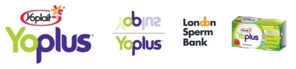
So, Yoplus is male in gender but it's distinctly homosexual because the purple color and the “plus” send an unambiguous message to those who can interpret the elements.
 The packaging displays it on a circle with elements around the circumference that suggest the sphincter to strengthen the brand's sodomite gateway identity.
 Overlaying the two together like I've done in this set, what appears is a kind of straight version of the Yoplus and Yoplait lids promotional imagery. Really, though, both the female and male gendered branding is distinctly homosexual, even sodomite.
Yo! PLAY! Isn't sexual “play” what the brand is all about?
Anal sex is the message of their Greek yogurt branding. “Greek: Anal sex. Used mostly as a euphemism in prostitution circles.” (Urban Dictionary #1) “Greek - Get Down With It.”
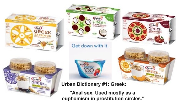
The branding of their Greek yogurt emphasizes a variety of forms that are typically referred to as “mandala.” “Mandala” means “circle” in Sanskrit. These have spiritual and ritual significance in both Hinduism and Buddhism. They are magickal emblems used for meditation and trance induction, idols representing the principal deities - and stylized sodomite portals!
 In this next collection of images some more of the Yoplait brand's sodomite gateway imagery is featured. Their Calin + product is labeled like a pharmaceutical with the red cross. The name “Calin” is similar to “colon,” a fact that is probably perceived by most folks who may be interested in the product. What most won't perceive, however, is that by +, they mean the addition of a phallus. The attention given the dot in the “i” calls it out as an “i” of Horus, a symbol that is enhanced by being set inside an oval. On the label, the red band butts up against the woman's backside. Observe the positioning of the words, “strong bones.” Bone = phallus. The red plus sign is near her head.
  She is illuminated through ritual sodomy. She stands upon a reclined Royal arch and squared circle. She is a “hands up” person. She is Osiris green. The white lily symbolizes “resurrection.”
 The Yoplus packaging seen just above is labeled differently from what I presented earlier, replacing one sodomite version with another. Here, the squared circle of the witch's magick circle appears. The sodomite plus sign is featured, which serves to connect the word and the symbol for us.
Perhaps the Yoplus is intended to be enjoyed with some TAZO tea?
In this set of images, the GoGurt branding leverages the phallic arrow on the “o” to mimic the familiar astrological Mars and male gender symbol. Set between two letters G (G-EYE tract and Gnosis), this is a pedophile (little “o”) version of the sodomite male train, an example akin to the Toys for Tots logo.
 That young blonde gripping the purple hand grip on the bike has quite a grip on that other purple thing, the GoGurt. If you see that as a big phallus, you can glean from this how more sex magick is being performed as children engage with and consume this product, which is squeezed and sucked out of the dispensing container! Pedobear that!
  You can bet the demonic energy from this is being harvested in Satanic ritual. Purple rays and the yellow-in-red (orange) supports the homosexual symbolism in the lower image. The GOG of the biblical pairing with Magog seems to be suggested.
  I see a subtle 666 presented in the upper image's wordmark where a 6 is found in each G with one more in the stylized letter U.
 I believe the YO in Yoplait connects the Y=male and O=female in a merging of the genders. Baphomet, which you see here represented in the popular version rendered by Eliphas Levi, is a kind of mirrored version of the Adam, as “male and female created He them.” There are no counterfeit 3 dollar bills, you should know. Adam was male dominant, but this perverted counterpart is a female dominant androgyny. This Baphomet is one of the symbolic meanings of the squared (male) circle (female).
There's even more to be known about this Yoplait brand, as a partnership with a
 Hermaphrodite white rabbit is exploited to what must be a great effect. I'll address in another post, Lord willing.
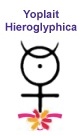
And so, with all that, I'll close with one last image, which is well earned by the brand. Yoplait Hieroglyphica. John Dee would surely approve; of the branding, and not, of course, of the blown cover exposing his perverse god's evil scheme.
Hey Bob,
ReplyDeleteExcellent work decoding the rich imagery!
I believe the "YO Plus" images have yet another layer of foul signaling to them. Notice how the Y and "+" are displayed over a cherry on one box and a flower on the other. We can take this as two variants on a theme here with the "taking of the cherry" as well as "de-flowering".
I believe the intent is to signal both of these elements in reference to vaginal and anal sex as well as in the heterosexual and homosexual sense. Urban dictionary is rather explicit about "anal cherry" and "anal flower".
Despite the "play" in their branding, these folks are serious about their signals.
Aaron
Indeed!
Delete